Steve Bennett blogs

…about maps, open data, Git, and other tech.

Tag Archives: maps

Your own personal National Map with TerriaJS: no coding and nothing to deploy

National Map is a pretty awesome place to find geospatial open data from all levels of Australian government.  (Disclaimer: I work on it at NICTA). But thanks to some not-so-obvious features in TerriaJS, the software that drives it, you can actually create and share your own private version with your own map layers – without programming, and without deploying any code.

What you get:

  • A 3D, rotateable, zoomable globe, thanks the awesome Cesium library. (It seamlessly falls back to Leaflet if 3D isn’t available.)
  • Selectable layers, grouped into an organised hierarchy of your devising
  • Support for a wide range of spatial services: WMS, WFS, ESRI (both catalogs and individual layers for all of these), CKAN, individual files like GeoJSON and KML, and even CSV files representing regions like LGAs, Postcodes, States…
  • Choose your own basemap, initial camera position, styling for some spatial types, etc.

1. Make your own content with online tools

Want to create your own spatial layer – polygons, lines and points? Use geojson.io and choose Save > Gist to save the result to Github Gist. (Gist is just a convenient service that stores text on the web for free).

Screenshot 2015-07-02 07.56.52

How about a layer of data about suburbs by postcode? Create a Google Sheet that follows the csv-au-geo specification (it’s easy!), download as CSV, paste it into a fresh Gist.

Screenshot 2015-07-02 08.02.28

2. Create a catalog with the Data Source Editor

Using the new TerriaJS Data Source Editor (I made this!), create your new catalog. You’re basically writing a JSON file but using a web form (thanks json-editor!) to do it.

To add one of your datasources on Gist, make sure you link to the Raw view of the page:

Screenshot 2015-07-02 08.07.02

Screenshot 2015-07-02 08.08.16

Don’t forget to select the type for each file: GeoJSON, CSV, etc.

3. Add more data

You might want to bring in some other data sources that you found on National Map. This can be a little tricky – there’s a lot of complexity in accessing data sources that National Map hides for you.

But here’s roughly how to go about it for a WMS (web map service) data source.

In the layer’s info window, grab the WMS URL

Screenshot 2015-07-02 10.53.13

You’ll need to put “http://nationalmap.gov.au/proxy/” in front of a some layers, because their WMS servers don’t support CORS.

You’ll also need the value of the “Layer name” field. (For Esri layers you need to dig a bit further.)

Screenshot 2015-11-13 11.10.55

(Yes, this layer is called “2”)

Add a WMS layer, and add “Layers Names” as an additional property. So it looks like this:

Screenshot 2015-07-02 10.55.54

4. Tweak your presentation

You can add extra properties to layers to fine tune their appearance. For example, for our CSV dataset:

Screenshot 2015-07-02 10.57.49

You might want to set “Is Enabled” and “Is Shown” on every layer so they display automatically.

And finally, you might want to set an initial camera and base map, so the view doesn’t start off the west coast of Africa with a satellite view.

Screenshot 2015-07-02 10.39.55

5. Save and preview

Screenshot 2015-07-02 10.46.41

As you make changes, click “Save to Gist” to save your configuration file to a secret location on Gist. You can then click “Preview your changes in National Map”.

Screenshot 2015-07-02 11.01.19

Make a note of the Gist link so you can keep working on it in the future. You can’t modify an existing configuration, but you can load from there and save a new copy.

6. Share!

Now you have a long URL like this: http://nationalmap.research.nicta.com/#clean&https%3A%2F%2Fgist.githubusercontent.com%2Fanonymous%2Fc3f181ca742b9ed94fe4%2Fraw%2F10853f7d8bb33610e4f2ce26947eaf6882192957%2Fdatasource.json

So, use tinyurl.com or another URL shortening service to get something more useful:

http://tinyurl.com/myawsummap

Cycletour.org: a better map for Australian cycle tours

Cycletour.org is a tool for planning cycle tours in Australia, and particularly Victoria. I made it because Google Maps is virtually useless for this: poor coverage in the bush and inappropriate map styling make cycle tour planning a very frustrating experience.

Let’s say we want to plan a trip from Warburton to Stratford, through the hills. This is what Google Maps with “bicycling directions” offers:

Google Maps - useless for planning cycle tours.

Google Maps – useless for planning cycle tours.

Very few roads are shown at this scale. Unlike motorists, we cyclists want to travel long distances on small roads. A 500 kilometre journey on narrow backstreets would be heaven on a bike, and a nightmare in a car. So you need to see all those roads when zoomed out.

Worse, small towns such as Noojee, Walhalla and Woods point are completely missing!

Enter Cycletour.org:

Screenshot 2015-01-09 18.03.59

You can plan a route by clicking a start and end, then dragging the route around:

Screenshot 2015-01-13 23.43.12

It doesn’t offer safe or scenic route selection. The routing engine (OSRM) just picks the fastest route, and doesn’t take hills into account. You can download your route as a GPX file, or copy a link to a permanent URL.

Cartography

The other major features of cycletour.org’s map style are:

Screenshot 2015-01-09 18.12.04Bike paths are shown prominently. Rail trails (old train lines converted into bike paths) are given a special yellow highlighting as they tend to be tourist attractions in their own right.

Train lines (in green) are given prominence, as they provide transport to and from trips.


Screenshot 2015-01-09 18.20.23Towns are only shown if there is at least one food-related amenity within a certain distance. This is by far the most important information about a town. Places that are simply “localities” with no amenities are relegated to a microscopic label.


Screenshot 2015-01-09 18.27.40Major roads are dark gray, progressing to lighter colours for minor roads. Unsealed roads are dashed. Off-road tracks are dashed red lines. Tracks that are tagged “four-wheel drive only” have a subtle cross-hashing.

And of course amenities Screenshot 2015-01-09 18.57.40useful to cyclists are shown: supermarkets, campgrounds, mountain huts, bike shops, breweries, wineries, bakeries, pubs etc etc. Yes, well-supplied towns look messy, but as a user, I still prefer having more information in front of me.

Terrain

Screenshot 2015-01-09 19.11.23The terrain data is a 20 metre-resolution digital elevation model from DEPI, within Victoria, trickily combined with a 90m DEM elsewhere, sourced from SRTM (NASA). I use TileMill‘s elevation shading feature, scaled so that sea level is a browny-green, and the highest Australian mountains (around 2200m) are white, with green between. 20-metre contours are shown, labelled at 100m intervals.

I’m really happy with how it looks. Many other comparable maps have either excessively dark hill shading, or heavy contours – or both.

Screenshot 2015-01-09 19.21.02

4UMaps

Screenshot 2015-01-09 19.20.35

Komoot

Screenshot 2015-01-09 19.20.24

OpenCycleMap

Screenshot 2015-01-09 19.20.15

Sigma

Mapbox Outdoors

Google Maps (terrain mode)

Screenshot 2015-01-09 19.35.37

MapBox Outdoors


Other basemaps

Screenshot 2015-01-09 19.39.25

VicMap

I’ve included an assortment of common basemaps, including most of the above. But the most useful is perhaps VicMap, because it represents a completely different data source: the government’s official maps.

Layers

Vegetation

Vegetation

There are also optional overlays. Find a good spot to stealth camp with the vegetation layer.

Or avoid busy roads with the truck volume layer. This data comes from VicRoads.Screenshot 2015-01-09 19.47.43

The bike shops layer makes contingency planning a bit easier, by making bike shops visible even when zoomed way out. The data is OpenStreetMap, so if you know of a bike shop that’s missing (or one that has since closed down), please update it so everyone can benefit.

Screenshot 2015-01-14 00.06.20

Mobile

Unfortunately, the site is pretty broken on mobile. But you can download the tiles for offline use on your Android phone using the freemium app Maverick. It works really well.

Other countries

Screenshot 2015-01-14 00.46.05

is.cycletour.org for Iceland. Yes, it’s real – but I don’t know how long I will maintain it.

It’s a pretty major technical undertaking to run a map for the whole world. I’ve automated the process for setting up cycletour.org as much as possible, and created my own version for Iceland and England when I travelled there in mid 2014. If you’re interested in running your own, get in touch and I’ll try to help out.


Feedback?

I’d love to hear from anyone that uses cycletour.org to plan a trip. Ideas? Thoughts? Bugs? Suggestions? Send ’em to stevage@gmail.com, or on Twitter at @Stevage1.

Web map projections: the bare minimum you need to know

TileMill wants to know: what projection is this data?

TileMill wants to know: what projection is this data?

If you’re making maps, you will probably need to know something about cartographic projections. Here’s the minimum.

  1. The globe is round, maps are flat. Each of the hundreds of different methods for converting from round to flat is a projection.
  2. When you have a latitude and longitude, you have unprojected coordinates. Anything you can do with these doesn’t require choosing a projection.
  3. Most consumer web maps use the Web Mercator projection, also known as the Google Web Map de facto standard, EPSG:900913 (“google” written with numbers), EPSG:3857, etc.
  4. Government agencies, desktop apps and other stuff often use the WGS84 projection, also known as EPSG:4326.
  5. It is technically straightforward to convert from unprojected coordinates to any projection, or between projections, using GIS packages or command line tools like GDAL. It can be slow to do this on the fly.
  6. Each projection is defined using a Spatial Reference System. An SRS can also define systems of unprojected coordinates, and even other planets.
  7. There are half a dozen common formats for describing the SRS, including:
    1. SRID, an identifier including the identifier scheme, like “EPSG:3857”, “ESRI:102113” or “SR-ORG:7483”.
    2. proj4, a short piece of text with lots of + and =, used by a tools like GDAL and TileMill. It looks like:
      +proj=longlat +ellps=WGS84 +datum=WGS84 +no_defs 
    3. Well-known text (WKT), a verbose format that can also be used to define spatial data. For example:
      GEOGCS[“GCS_Oman”,
      DATUM[“Oman”,
      SPHEROID[“Clarke_1880_RGS”,6378249.145,293.465]],
      PRIMEM[“Greenwich”,0],
      UNIT[“Degree”,0.017453292519943295],
      AUTHORITY[“EPSG”,”37206″]]
  8. The tool you are working with (eg, TileMill) will only support certain projections. You need to:
    1. Find data that is in the right projection (Web Mercator is the safest), or convert it; and
    2. Tell the tool what projection it’s in, if it can’t guess. You will have to pick from a list, or use one of the formats above, that it supports.

Multivariate binary symbol maps with TileMill.

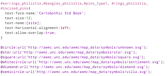
I help researchers make maps of their research. An archaeologist recently wanted to visualise the distribution of some iron-age artefacts around the Levant, based on a spreadsheet of thousands of rows. Each row represents one kind of artefact at a given site, such as “3 incised bangles, subtype I.b.iv, at Gath.” What are these maps called? I’ll go with “multivariate binary symbol map”.

It sounded like a job for CartoDB, but as the requirements unfolded, she wanted pretty specific cartography, plus a custom base map of rivers, historical boundaries etc. So we used TileMill instead, although we didn’t end up getting all that done.

Image

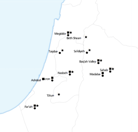
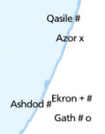
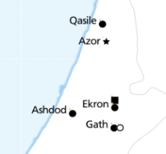
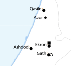
This is where we got to. Each symbol next to a place name represents the presence of a specific type of artefact. ‘Eitun has pins of Type 1 with “incised decorations”, Far’ah has pins of Type 1 with “incised decorations”, “plain decorations” and “ribbed/grooved decorations”.

The most complex of these maps has 6 different attributes:

Image

Loading the data

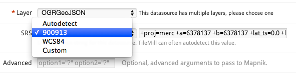
With a clearer understanding of exactly what we were trying to achieve, I probably would have done something simpler to calculate each of these attributes, such as using Excel. Instead, I loaded the data into PostGIS and wrote some queries. TileMill supports CSV files directly, but unlike CartoDB, doesn’t load the data into a database, so you can’t run SQL queries.

This post from “The World is a Village” explains how to load CSV into PostGIS, but in summary:

Image


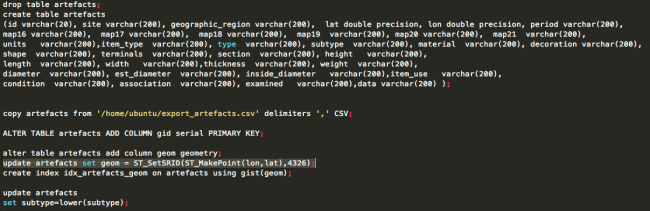
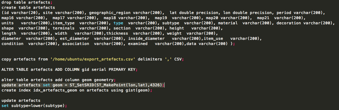
The most interesting line is:

update artefacts set geom = ST_SetSRID(ST_MakePoint(lon,lat),4326);

That’s what converts the raw lon and lat columns into a geometry column so that TileMill can plot it.

Views

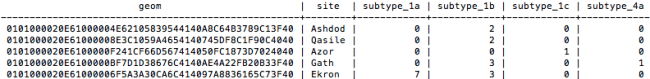
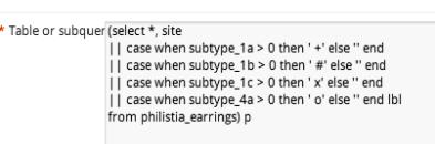
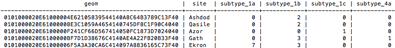
To determine “are there any artefacts of type X in location Y”, an easy way is to write a view. Each column is a different subquery, for a different X.

Image

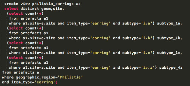
That gives data like this:

Image


So, in TileMill we can now use a filter like [subtype_1a>0] to decide whether to place a symbol.

TileMill

Because there were so many maps to produce (5 of this type, plus another 11), I created them all in one project, each as a single layer.

Image


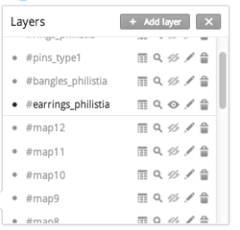
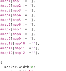
The #map1 to #map12 layers refer to a different set of data. Each layer pulls in the same spreadsheet, and styles it identically, with the only difference being a single filter.

Image

That turned out to work really well.

But back to the main problem of showing symbols for attributes. It’s easy to show a single symbol if an attribute is present (like a coffee icon if a site is a cafe). But how do you show 4 symbols simultaneously, without them overlapping?

I thought of two approaches.

Symbol approach 1: Fonts

It’s theoretically possible to construct a text string, with an appropriate font. The string could look like “A Q Z”, where A gets rendered as a square, Q as a circle and Z as a star. Unfortunately I couldn’t make it work. I just couldn’t find an open truetype font that would behave like this. I tried loading various WingDings fonts, but always got little boxes instead of symbols.

There are projects like Map Icons or Font Awesome which sort of do this, but using web technologies that aren’t compatible with TileMill. The only proof of concept I achieved was using punctuation.

Image

Using fonts makes it very easy to space icons appropriately:

Image

Using punctuation in this way just doesn’t look good.

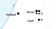
Symbol approach 2: marker icons

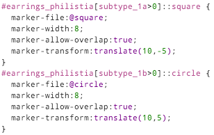
So the second approach is using traditional markers, and finding a way to position them appropriately. In CartoCSS, there’s no “marker-dx” to offset a marker, but there is “marker-transform“. So you can use SVG transforms, such as translate().

marker-transform:translate(10,-5);

That positions your marker 10 pixels right, and 5 pixels up.


Image


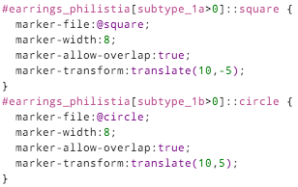
Each different symbol has to be given its own layer (::square, ::circle…), and a different translation offset: (10, -5), (10, 5), (20, -5) etc.

This guarantees that they don’t collide, and mostly looks good:

Image

although it inevitably leads to odd positioning:

Image


With enough time, you could some write some fancy SQL that would stack symbols from the left, avoiding any gaps.

Other TileMill styling

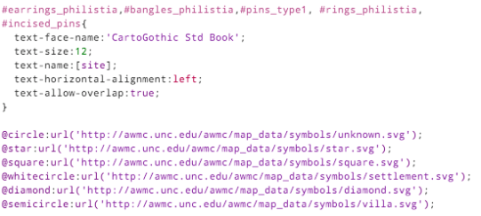
The only other styling of note is that the text labels should appear right-justified, to the left of the exact position. The CartoCSS designation for this is text-horizontal-alignment: left.

Image

You can see the full TileMill project on Github.
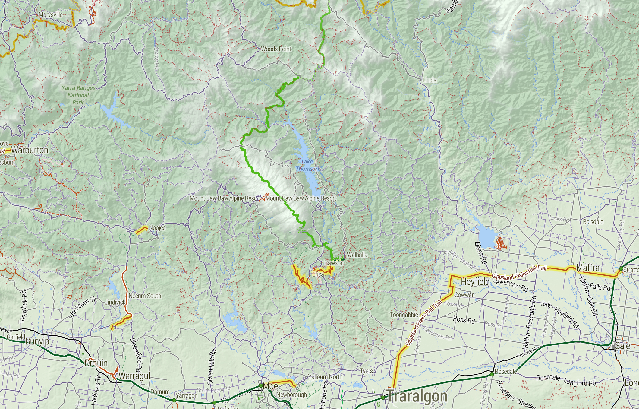
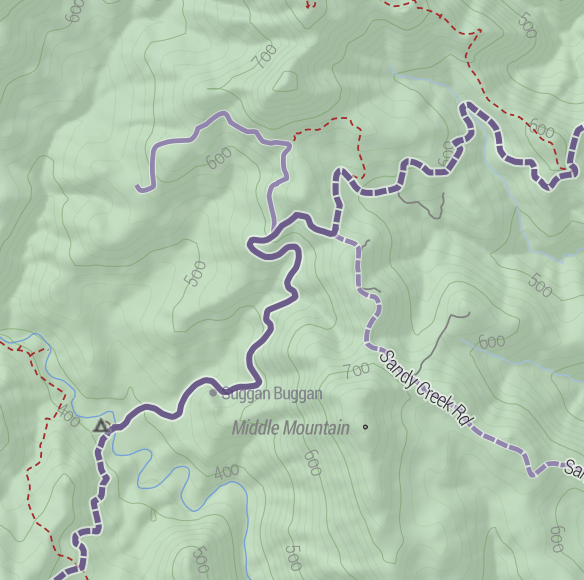
 

Cycletouring and OpenStreetMapping: a beautiful symbiosis

Contributing to OpenStreetMap is diversely rewarding: you help other people, you make open data as a whole more viable, you learn a lot about the area you’re mapping, and it’s fun. But sometimes it’s just plain pragmatic. Last weekend, I organised a cycle tour from Bendigo to Avenel, via the O’Keefe Rail Trail, Lake Eppalock, Colbinabbin, Rushworth, Murchison and Nagambie. When I started planning the route, OpenStreetMap looked like this:

Image

The major features are all there, but what’s missing is what matters most to cycle tourists: quiet country roads, and road surfaces. Is there a way to get from Eppalock to Colbinabbin on only sealed roads? Is Buffalo Swamp Rd (near Murchison) really sealed? A great way for me to research is to add to OpenStreetMap: use aerial imagery to add new roads, paying attention to whether they look sealed or not from the air.

Image

So Buffalo Swamp Road is obviously not sealed after all. By the time I was done, the map of the area looked like this:

Image

Notice how many “sealed” roads have turned out to be dirt, but also how many other unmapped little roads have been added to the map.

Once this is done, the steps are:

  1. Finalise the route, using OSRM.
  2. Send GPX files to everyone on the trip
  3. Load the GPX files onto both my GPS and Maverick Pro, an Android App
  4. Also load the cycletour.org tiles into Maverick
  5. Ride
  6. Update OpenStreetMap afterwards with any fresh information – obstacles, unexpected connections, local businesses, and so on.

There’s still lots more to add, but it’s nice that just planning this one trip has significantly improved coverage in a whole region like this.

Super lightweight map websites with Github

Github, the online version control repository host for Git, recently added support for GeoJSON files. Sounds boring, right? It actually lets you do something very cool: build your own “dots on a map” website with virtually zero code.

An example of GeoJSON on Github I whipped up.

An example of GeoJSON on Github I whipped up. Click it.

Here’s what you need to do.

  1. Get a Github repository if you don’t have one already. They’re free.
  2. Create a GeoJSON file. You can export to this format from various tools. One easy way to get started would be to upload a CSV file with locations to dotspotting.org then download the GeoJSON from there. Or even easier, use geojson.io to place dots, lines and polygons with a graphical tool. It can save directly to your GitHub.
  3. Here’s what my test file looks like:
    {
     "type": "FeatureCollection",
     "features": [{ "type": "Feature",
     "geometry": {
     "type": "Point",
     "coordinates": [144.9,-37.8]
     },
     "properties": {
     "title": "Scooter",
     "description": "Here's a dot",
     "marker-size": "medium",
     "marker-symbol": "scooter",
     "marker-color": "#a59",
     "stroke": "#555555",
     "stroke-opacity": 1.0,
     "stroke-width": 2,
     "fill": "#555555",
     "fill-opacity": 0.5
     }
     },
     { "type": "Feature",
     "geometry": {
     "type": "Point",
     "coordinates": [144.4,-37.5]
     },
     "properties": {
     "title": "Cafe",
     "description": "Coffee and stuff",
     "marker-size": "medium",
     "marker-symbol": "cafe",
     "marker-color": "#f99",
     "stroke": "#555555",
     "stroke-opacity": 1.0,
     "stroke-width": 2,
     "fill": "#555555",
     "fill-opacity": 0.5
     }
     }]
    }

    It’s worth validating with GeoJSONLint.

  4. Commit this file, say test.geojson, to your Github repository. You can get a preview of it in Github:

    The test GeoJSON file, as seen on GitHub.

    The test GeoJSON file, as seen on GitHub.

  5. Now the really cool part. Embed the map into your own website. This is stupidly easy:
    <!DOCTYPE html>
    <html>
    <body>
    <script src="https://embed.github.com/view/geojson/stevage/georly/master/test1.geojson?height=500&width=1000"></script>
    </body>
    </html>

    If you don’t have a website, site44 is an extremely easy way to get started. You place HTML files into your DropBox, and they get automagicked onto the web, with a subdomain: something.site44.com.

Now what?

That’s it! What’s especially interesting about the hosting on GitHub is it’s a very easy way to have a lightweight shared geospatial database of points, lines or polygons. Here’s how you could add dots to my map:

  1. Fork my repository
  2. Add a few points, by modifying the GeoJSON file
  3. Commit your changes to your repository.
  4. Send me a pull request
  5. I accept the changes, and voila – now your points are shown with mine.

Using this method, we have a “review before publish” workflow, and a full version history of every change.

Caveats

This is a nifty tool for prototyping social mapping applications, but it obviously won’t cut it for production purposes:

  • No support for different layers: all the dots are always shown
  • No support for different basemaps: always the same OpenStreetMap style
  • No authoring tools: you must use something else to generate the GeoJSON
  • Obligatory “rendered with (heart) by GitHub” footer.

Soon you’ll want to build a proper application, using tools like MapBox, CloudMade, CartoDB, Leaflet etc.