Steve Bennett blogs

…about maps, open data, Git, and other tech.

Tag Archives: tilemill

You might not need PostGIS: streamlined vector tile processing for big map visualisations

I recently re-engineered the data processing behind OpenTrees.org. It’s a website that lets you explore the combined open tree databases of 21 local councils around Australia (over 800,000!), with some pretty data visualisations. Working on this site has taught me a lot about processing data into vector tiles. Today’s lesson: “You might not need PostGIS”.

Screenshot 2018-05-15 11.19.19.png

Trees from Melbourne, Hobson’s Bay and Brimbank.

First version: Tilemill, PostGIS, PGRestAPI

The architecture of v1 looked like this: (See “OpenTrees.org: how to aggregate 373,000 trees from 9 open data sources“).

  • Configuration file in JSON stores the location of each source file.
  • Bash scripts using JQ (yes, really) to run wget, ogr2ogr and psql to fetch, convert and load each datafile into PostGIS.
  • SQL scripts to merge and clean the datasets together into a single schema.
  • Tilemill to generate raster tiles from the data.
  • PGRestAPI to provide a queryable interface to the data (particularly to allow the map to zoom to a particular tree by ID).
  • Nginx serving the front end, built with Mapbox.js (a wrapper around Leaflet).
  • The magic of UTFGrid allows interrogating individual tree points. (I still love this technology.)

It worked fairly well, but with the huge disadvantage of having to host a web-accessible server, complete with database.

Second version: Mapbox-GL-JS, vector tiles, static hosting

When I lost access to my free hosting, I re-architected it using Mapbox-GL-JS: v2.

  • Same scripts to fetch and process data into PostGIS.
  • More scripts which export data out of PostGIS and call Tippecanoe to generate vector tiles, which I then upload to Mapbox.com.
  • No Tilemill
  • Brand new front-end built using Mapbox-GL-JS, with some clever new data visualisation, such as visualising by “rarity”.
  • No PGRestAPI. Clicking on a tree updates the URL to include its lat/long, so you have a shareable link that will go to that tree.
  • Front end hosted on Github Pages.

Now we don’t need a server (Github Pages and Mapbox are serving everything we need, and are free). But we still have the heavy dependency of PostGIS.

Do we really need PostGIS?

What is PostGIS actually doing in this scenario? Mostly it’s doing very simple row-oriented, non-relational operations like:

Screenshot 2018-05-15 10.35.52.png

or:

Screenshot 2018-05-15 10.36.24.png

(Yes, I should have used SPLIT_PART())

And then finally we just dump the whole table out to disk.

I began trying to replace it with Spatialite, but that didn’t seem to play very nicely with NodeJS for me. As soon as it got fiddly, the benefits of using it over Postgres began to disappear.

And why did I even need it? Mostly because I already had scripts in SQL and just didn’t want to rewrite them.

So, the disadvantages of PostGIS here:

  • It’s a big, heavy dependency which discourages any other contributors.
  • The data processing scripts have to be in SQL, which introduces a second language (alongside Javascript).
  • No easy way to generate newline-delimited GeoJSON (which would make generating vector tiles a bit faster.)

Third version: NodeJS, Mapbox

So, I rewrote it as v3:

  • Replaced the Bash scripts with NodeJS. Which means, instead of the nonsense of JQ, we have sensible looking Javascript for which the JSON config files work well.
  • Instead of loading Shapefiles into PostGIS, I convert everything into GeoJSON.
  • Instead of SQL “merge” scripts, a NodeJS script processes each tree then writes them all out as a single, line-delimited GeoJSON file.
  • Tippecanoe then operates on that file to generate vector tiles, which I upload to Mapbox.
  • Split the repository in two: one for the data processing (“opentrees-data“), and a separate one for the front end (“opentrees“). This seems to be a good pattern.

The workflow now looks like:

  1. 1-gettrees.js uses a configuration file to fetch datasets from predefined locations and save them, in whatever formats, in a standard place.
  2. 2-loadtrees.js converts each of these files into a geojson file using OGR2OGR.
  3. 3-processFiles.js loads each of these, processing all the individual trees into a standard schema, then writes out a single combined line-delimited GeoJSON.
  4. 4-vectorTiles.sh uses Tippecanoe to generate an mbtiles from the GeoJSON.

The processing scripts now look like:

Screenshot 2018-05-15 10.06.04.png

Screenshot 2018-05-15 10.07.11

For now, each GeoJSON file is loaded entirely in one synchronous load operation.

Screenshot 2018-05-15 10.41.32

(Processing all the GeoJSONs this way takes about 55 seconds on my machine. Loading them asynchronously reduces that to about 45. Most of the time is probably in the regular expressions.)

The only slight hurdle is generating the species count table. With PostGIS, this is just one more query run after all the others:

Screenshot 2018-05-15 10.23.15.png

In NodeJS, our “process each tree once” workflow can’t support this. After processing them once (counting species as we go), we process them all again to attach the species count attribute.

Screenshot 2018-05-15 10.19.27

If we were doing a lot of statistics, possibly PostGIS would start to look attractive again.

Do we really need OGR2OGR?

The next dependency I would like to remove is OGR2OGR. It is there because datasets arrive in formats I can’t control (primarily CSV, Shapefile, GeoJSON). I love using Mike Bostock’s shapefile library, but it doesn’t currently support projections other than EPSG:4326. That’s not a showstopper, just more work.

It would also be great not to have to maintain VRT files (in XML!) to describe the CSV formats in which data arrives.


OpenTrees.org: how to aggregate 373,000 trees from 9 open data sources

I try to convince government bodies, especially local councils, to publish more open data. It’s much easier when there is a concrete benefit to point to: if you publish your tree inventory, it could be joined up with all the other councils’ tree inventories, to make some kind of big tree-explorey interface thing.

Introducing: opentrees.org. It’s fun! Click on “interesting trees”, hover over a few, and click on the ones that take your fancy. You can play for ages.

Here’s how I made it.

First you get the data

Through a bit of searching on data.gov.au, I found tree inventories (normally called “Geelong street trees” or similar) for: Geelong, Ballarat (both participating in OpenCouncilData), Corangamite (I visited last year), Colac-Otways (friends of Corangamite), Wyndham (a surprise!), Manningham (total surprise). It showed two results from data.sa.gov.au: Adelaide, and the Waite Arboretum (in Adelaide). Plus the City of Melbourne’s (open data pioneers) “Urban Forest” dataset on data.melbourne.vic.gov.au.

Every dataset is different. For instance:

  • GeoJSON’s for Corangamite, Colac-Otways, Ballarat, Manningham
  • CSV for Melbourne and Adelaide. Socrata has a “JSON” export, but it’s not GeoJSON.
  • Wyndham has a GeoJSON, but for some reason the data is represented as “MultiPoint”, rather than “Point”, which GDAL couldn’t handle. They also have a CSV, which are also very weird, with an embedded WKT geometry (also MULTIPOINT), in a projected (probably UTM) format. There are also several blank columns.
  • Waite Arboretum’s data is in zipped Shapefile and KML. KML is the worst, because it seems to have attributes encoded as HTML, so I used the Shapefile.

Source code for gettrees.sh.

Tip for data providers #1: Choose CSV files for all point data, with columns “lat” and “lon”. (They’re much easier to manipulate than other formats, it’s easy to strip fields you don’t need, and they’re useful for doing non-spatial things with.)

Then you load the data

Next we load all the data files, as they are, into separate tables in PostGIS. GDAL is the magic tool here. Its conversion tool, ogr2ogr, has a slightly weird command line but works very well. A few tips:

  • Set the target table geometry type to be “GEOMETRY”, rather than letting it choose a more specific type like POINT or MULTIPOINT. This makes it easier to combine layers later.
    -nlt GEOMETRY
  • Re-project all geometry to Web Mercator (EPSG:3857) when you load. Save yourself pain.
    -t_srs EPSG:3857
  • Load data faster by using Postgres “copy” mode:
    –config PG_USE_COPY YES
  • Specify your own table name:
    -nln adelaide

Tip for data providers #2: Provide all data in unprojected (latitude/longitude) coordinates by preference, or Web Mercator (EPSG:3857).

CSV files unfortunately require creating a companion ‘.vrt’ file for non-trivial cases (eg, weird projections, weird column names). For example:
<OGRVRTDataSource>
<OGRVRTLayer name="melbourne">
<SrcDataSource>melbourne.csv</SrcDataSource>
<GeometryType>wkbPoint</GeometryType>
<LayerSRS>WGS84</LayerSRS>
<GeometryField encoding="PointFromColumns" x="Longitude" y="Latitude"/>
</OGRVRTLayer>
</OGRVRTDataSource>

The command to load a dataset looks like:
ogr2ogr --config PG_USE_COPY YES -overwrite -f "PostgreSQL" PG:"dbname=trees" -t_srs EPSG:3857 melbourne.vrt -nln melbourne -lco GEOMETRY_NAME=the_geom -lco FID=gid -nlt GEOMETRY
Source code for loadtrees-db.sh.

Merge the data

Unfortunately most councils do not yet publish data in the (very easy to follow!) opencouncildata.org standards. So we have to investigate the data and try to match the fields into the scheme. Basically, it’s a bunch of hand-crafted SQL INSERT statements like:
INSERT INTO alltrees (the_geom, ref, genus, species, scientific, common, location, height, crown, dbh, planted, maturity, source)
SELECT the_geom,
tree_id AS ref,
genus_desc AS genus,
spec_desc AS species,
trim(concat(genus_desc, ' ', spec_desc)) AS scientific,
common_nam AS common,
split_part(location_t, ' ', 1) AS location,
height_m AS height,
canopy_wid AS crown,
diam_breas AS dbh,
CASE WHEN length(year_plant::varchar) = 4 THEN to_date(year_plant::varchar, 'YYYY') END AS planted,
life_stage AS maturity,
'colac_otways' AS source
FROM colac_otways;

Notice that we have to convert the year (“year_plant”) into an actual date. I haven’t yet fully handled complicated fields like health, structure, height and dbh, so there’s a mish-mash of non-numeric values, different units (Adelaide records the circumference of trees rather than diameter!)

Tip for data providers #3: Follow the opencouncildata.org standards, and participate in the process.

Source code for mergetrees.sql

Clean the data

We now have 370,000 trees but it’s of very variable quality. For instance, in some datasets, values like “Stump”, “Unknown” or “Fan Palm” appear in the “scientific name” column. We need to clean them out:
UPDATE alltrees
SET scientific='', genus='', species='', description=scientific
WHERE scientific='Vacant Planting'
OR scientific ILIKE 'Native%'
OR scientific ILIKE 'Ornamental%'
OR scientific ILIKE 'Rose %'
OR scientific ILIKE 'Fan Palm%'
OR scientific ILIKE 'Unidentified%'
OR scientific ILIKE 'Unknown%'
OR scientific ILIKE 'Stump';

We also want to split scientific names into individual genus and species fields, handle varieties, sub-species and so on. Then there are the typos which, due to some quirk in tree management software, become faithfully and consistently retained across a whole dataset. This results in hundreds of Angpohoras, Qurecuses, Botlebrushes etc. We also need to turn non-values (“Not assessed”, “Unknown”, “Unidentified”) into actual NULL values.
UPDATE alltrees
SET crown=NULL
WHERE crown ILIKE 'Not Assessed';

Source code for cleantrees.sql

Tip for data providers #4: The cleaner your data, the more interesting things people can do with it. (But we’d rather see dirty data than nothing.)

Make a map

I use TileMill to make web maps. For this project it has a killer feature: the ability to pre-render a map of hundreds of thousands of points, and allow the user to interact with those points, without exploding the browser. That’s incredibly clever. Having complete control of the cartography is also great, and looks much better than, say, dumping a bunch of points on a Google Map.

As far as TileMill maps goes, it’s very conventional. I add a PostGIS layer for the tree points, plus layers for other features such as roads, rivers and parks, pointing to an OpenStreetMap database I already had loaded. Also show the names of the local government areas with their boundaries, which fade out and disappear as you zoom in.

My style is intentionally all about the trees. There are some very discreet roads and footpaths to serve as landmarks, but they’re very subdued. I use colour (from green to grey) to indicate when species and/or genus information is missing. The Waite Arboretum data has polygons for (I presume) crown coverage, which I show as a semi-opaque dark green.

OpenTrees.org TileMill screenshot


Source code for the TileMill CartoCSS style.

There’s also an interactive layer, so the user can hover over a tree to see more information. It looks like this:
<b>{{{common}}} <i>{{{scientific}}}</i></b>
<br/>
<table>
{{#genus}}<tr><th>Genus </th><td>{{{genus}}}</td></tr>{{/genus}}
{{#species}}<tr><th>Species</th><td>{{{species}}}</td></tr>{{/species}}
{{#variety}}<tr><th>Variety</th><td>{{{variety}}}</td></tr>{{/variety}}

...
I also whipped up two more layers:

  1. OpenStreetMap trees, showing “natural=tree” objects in OpenStreetMap. The data is very sketchy. This kind of data is something that councils collect much better than OpenStreetMap.
  2. Interesting trees. I compute the “interestingness” of a tree by calculating the number of other trees in the total database of the same species. A tree in a set of 5 or less is very interesting (red), 25 or less is somewhat interesting (yellow).

Source code for makespecies.sql.

Build a website

It’s very easy to display a tiled, interactive map in a browser, using Leaflet.JS and Mapbox’s extensions. It’s a lot more work to turn that into an interesting website. A couple of the main features:

  • The base CSS is Twitter Bootstrap, mostly because I don’t know any better.
  • Mapbox.js handles the interactivity, but I intercept clicks (map.gridLayer.on) to look up the species and genus on Wikipedia. It’s straightforward using JQuery but I found it fiddly due to unfamiliarity. The Wikipedia API is surprisingly rough, and doesn’t have a proper page of its own – there’s the MediaWiki API page, the Wikipedia API Sandbox, and this useful StackOverflow question which that community helpfully shut down as a service to humanity.
  • To make embedding the page in other sites (such as Open Council Data trees) work better, the “?embed” URL parameter hides the titlebar.
  • You can go straight to certain councils with bookmarks: opentrees.org/#adelaide
  • I found the fonts (the title font is “Lancelot“) on Adobe Edge.
  • The header background combines the forces of subtlepatterns.com and px64.net.

Source code for treesmap.html, treesmap.js, treesmap.css.

And of course there’s a server component as well. The lightweight tilelive_server, written mostly by Yuri Feldman, glues together the necessary server-side bits of MapBox’s technology. I pre-generate a large-ish chunk of map tiles, then the rest are computed on demand. This bit of nginx code makes that work (well, after tilelive_server generated 404s appropriately):
location /treetiles/ {
# Redirect to TileLive. If tile not found, redirect to TileMill.
rewrite_log on;
rewrite ^.*/(\d+)/(\d+)/(\d+.*)$ /supertrees_c8887d/$1/$2/$3 break;

proxy_intercept_errors on;
error_page 404 = @dynamictiles;
proxy_set_header Host $http_host;
proxy_pass http://127.0.0.1:5044;

proxy_cache my-cache;
}

location @dynamictiles {
rewrite_log on;
rewrite ^.*/(\d+)/(\d+)/(\d+.*)$ /tile/supertrees/$1/$2/$3 break;
proxy_pass http://guru.cycletour.org:20008;
proxy_cache my-cache;
}

Too hard basket

A really obvious feature would be to show native and introduced species in different colours. Try as I might, I could not find any database with this information. There are numerous online plant databases, but none seemed to have this information in a way I could access. If you have ideas, I’d love to hear from you.

It would also be great to make a great mobile app, so you can easily answer the question “what is this tree in front of me”, and who knows what else.

In conclusion

Dear councils,

  Please release datasets such as tree inventories, garbage collection locations and times, and customer service centres, following the open standards at opencouncildata.org. We’ll do our best to make fun, interesting and useful things with them.

Love,

The open data community

Cycletour.org: a better map for Australian cycle tours

Cycletour.org is a tool for planning cycle tours in Australia, and particularly Victoria. I made it because Google Maps is virtually useless for this: poor coverage in the bush and inappropriate map styling make cycle tour planning a very frustrating experience.

Let’s say we want to plan a trip from Warburton to Stratford, through the hills. This is what Google Maps with “bicycling directions” offers:

Google Maps - useless for planning cycle tours.

Google Maps – useless for planning cycle tours.

Very few roads are shown at this scale. Unlike motorists, we cyclists want to travel long distances on small roads. A 500 kilometre journey on narrow backstreets would be heaven on a bike, and a nightmare in a car. So you need to see all those roads when zoomed out.

Worse, small towns such as Noojee, Walhalla and Woods point are completely missing!

Enter Cycletour.org:

Screenshot 2015-01-09 18.03.59

You can plan a route by clicking a start and end, then dragging the route around:

Screenshot 2015-01-13 23.43.12

It doesn’t offer safe or scenic route selection. The routing engine (OSRM) just picks the fastest route, and doesn’t take hills into account. You can download your route as a GPX file, or copy a link to a permanent URL.

Cartography

The other major features of cycletour.org’s map style are:

Screenshot 2015-01-09 18.12.04Bike paths are shown prominently. Rail trails (old train lines converted into bike paths) are given a special yellow highlighting as they tend to be tourist attractions in their own right.

Train lines (in green) are given prominence, as they provide transport to and from trips.


Screenshot 2015-01-09 18.20.23Towns are only shown if there is at least one food-related amenity within a certain distance. This is by far the most important information about a town. Places that are simply “localities” with no amenities are relegated to a microscopic label.


Screenshot 2015-01-09 18.27.40Major roads are dark gray, progressing to lighter colours for minor roads. Unsealed roads are dashed. Off-road tracks are dashed red lines. Tracks that are tagged “four-wheel drive only” have a subtle cross-hashing.

And of course amenities Screenshot 2015-01-09 18.57.40useful to cyclists are shown: supermarkets, campgrounds, mountain huts, bike shops, breweries, wineries, bakeries, pubs etc etc. Yes, well-supplied towns look messy, but as a user, I still prefer having more information in front of me.

Terrain

Screenshot 2015-01-09 19.11.23The terrain data is a 20 metre-resolution digital elevation model from DEPI, within Victoria, trickily combined with a 90m DEM elsewhere, sourced from SRTM (NASA). I use TileMill‘s elevation shading feature, scaled so that sea level is a browny-green, and the highest Australian mountains (around 2200m) are white, with green between. 20-metre contours are shown, labelled at 100m intervals.

I’m really happy with how it looks. Many other comparable maps have either excessively dark hill shading, or heavy contours – or both.

Screenshot 2015-01-09 19.21.02

4UMaps

Screenshot 2015-01-09 19.20.35

Komoot

Screenshot 2015-01-09 19.20.24

OpenCycleMap

Screenshot 2015-01-09 19.20.15

Sigma

Mapbox Outdoors

Google Maps (terrain mode)

Screenshot 2015-01-09 19.35.37

MapBox Outdoors


Other basemaps

Screenshot 2015-01-09 19.39.25

VicMap

I’ve included an assortment of common basemaps, including most of the above. But the most useful is perhaps VicMap, because it represents a completely different data source: the government’s official maps.

Layers

Vegetation

Vegetation

There are also optional overlays. Find a good spot to stealth camp with the vegetation layer.

Or avoid busy roads with the truck volume layer. This data comes from VicRoads.Screenshot 2015-01-09 19.47.43

The bike shops layer makes contingency planning a bit easier, by making bike shops visible even when zoomed way out. The data is OpenStreetMap, so if you know of a bike shop that’s missing (or one that has since closed down), please update it so everyone can benefit.

Screenshot 2015-01-14 00.06.20

Mobile

Unfortunately, the site is pretty broken on mobile. But you can download the tiles for offline use on your Android phone using the freemium app Maverick. It works really well.

Other countries

Screenshot 2015-01-14 00.46.05

is.cycletour.org for Iceland. Yes, it’s real – but I don’t know how long I will maintain it.

It’s a pretty major technical undertaking to run a map for the whole world. I’ve automated the process for setting up cycletour.org as much as possible, and created my own version for Iceland and England when I travelled there in mid 2014. If you’re interested in running your own, get in touch and I’ll try to help out.


Feedback?

I’d love to hear from anyone that uses cycletour.org to plan a trip. Ideas? Thoughts? Bugs? Suggestions? Send ’em to stevage@gmail.com, or on Twitter at @Stevage1.

Web map projections: the bare minimum you need to know

TileMill wants to know: what projection is this data?

TileMill wants to know: what projection is this data?

If you’re making maps, you will probably need to know something about cartographic projections. Here’s the minimum.

  1. The globe is round, maps are flat. Each of the hundreds of different methods for converting from round to flat is a projection.
  2. When you have a latitude and longitude, you have unprojected coordinates. Anything you can do with these doesn’t require choosing a projection.
  3. Most consumer web maps use the Web Mercator projection, also known as the Google Web Map de facto standard, EPSG:900913 (“google” written with numbers), EPSG:3857, etc.
  4. Government agencies, desktop apps and other stuff often use the WGS84 projection, also known as EPSG:4326.
  5. It is technically straightforward to convert from unprojected coordinates to any projection, or between projections, using GIS packages or command line tools like GDAL. It can be slow to do this on the fly.
  6. Each projection is defined using a Spatial Reference System. An SRS can also define systems of unprojected coordinates, and even other planets.
  7. There are half a dozen common formats for describing the SRS, including:
    1. SRID, an identifier including the identifier scheme, like “EPSG:3857”, “ESRI:102113” or “SR-ORG:7483”.
    2. proj4, a short piece of text with lots of + and =, used by a tools like GDAL and TileMill. It looks like:
      +proj=longlat +ellps=WGS84 +datum=WGS84 +no_defs 
    3. Well-known text (WKT), a verbose format that can also be used to define spatial data. For example:
      GEOGCS[“GCS_Oman”,
      DATUM[“Oman”,
      SPHEROID[“Clarke_1880_RGS”,6378249.145,293.465]],
      PRIMEM[“Greenwich”,0],
      UNIT[“Degree”,0.017453292519943295],
      AUTHORITY[“EPSG”,”37206″]]
  8. The tool you are working with (eg, TileMill) will only support certain projections. You need to:
    1. Find data that is in the right projection (Web Mercator is the safest), or convert it; and
    2. Tell the tool what projection it’s in, if it can’t guess. You will have to pick from a list, or use one of the formats above, that it supports.

Multivariate binary symbol maps with TileMill.

I help researchers make maps of their research. An archaeologist recently wanted to visualise the distribution of some iron-age artefacts around the Levant, based on a spreadsheet of thousands of rows. Each row represents one kind of artefact at a given site, such as “3 incised bangles, subtype I.b.iv, at Gath.” What are these maps called? I’ll go with “multivariate binary symbol map”.

It sounded like a job for CartoDB, but as the requirements unfolded, she wanted pretty specific cartography, plus a custom base map of rivers, historical boundaries etc. So we used TileMill instead, although we didn’t end up getting all that done.

Image

This is where we got to. Each symbol next to a place name represents the presence of a specific type of artefact. ‘Eitun has pins of Type 1 with “incised decorations”, Far’ah has pins of Type 1 with “incised decorations”, “plain decorations” and “ribbed/grooved decorations”.

The most complex of these maps has 6 different attributes:

Image

Loading the data

With a clearer understanding of exactly what we were trying to achieve, I probably would have done something simpler to calculate each of these attributes, such as using Excel. Instead, I loaded the data into PostGIS and wrote some queries. TileMill supports CSV files directly, but unlike CartoDB, doesn’t load the data into a database, so you can’t run SQL queries.

This post from “The World is a Village” explains how to load CSV into PostGIS, but in summary:

Image


The most interesting line is:

update artefacts set geom = ST_SetSRID(ST_MakePoint(lon,lat),4326);

That’s what converts the raw lon and lat columns into a geometry column so that TileMill can plot it.

Views

To determine “are there any artefacts of type X in location Y”, an easy way is to write a view. Each column is a different subquery, for a different X.

Image

That gives data like this:

Image


So, in TileMill we can now use a filter like [subtype_1a>0] to decide whether to place a symbol.

TileMill

Because there were so many maps to produce (5 of this type, plus another 11), I created them all in one project, each as a single layer.

Image


The #map1 to #map12 layers refer to a different set of data. Each layer pulls in the same spreadsheet, and styles it identically, with the only difference being a single filter.

Image

That turned out to work really well.

But back to the main problem of showing symbols for attributes. It’s easy to show a single symbol if an attribute is present (like a coffee icon if a site is a cafe). But how do you show 4 symbols simultaneously, without them overlapping?

I thought of two approaches.

Symbol approach 1: Fonts

It’s theoretically possible to construct a text string, with an appropriate font. The string could look like “A Q Z”, where A gets rendered as a square, Q as a circle and Z as a star. Unfortunately I couldn’t make it work. I just couldn’t find an open truetype font that would behave like this. I tried loading various WingDings fonts, but always got little boxes instead of symbols.

There are projects like Map Icons or Font Awesome which sort of do this, but using web technologies that aren’t compatible with TileMill. The only proof of concept I achieved was using punctuation.

Image

Using fonts makes it very easy to space icons appropriately:

Image

Using punctuation in this way just doesn’t look good.

Symbol approach 2: marker icons

So the second approach is using traditional markers, and finding a way to position them appropriately. In CartoCSS, there’s no “marker-dx” to offset a marker, but there is “marker-transform“. So you can use SVG transforms, such as translate().

marker-transform:translate(10,-5);

That positions your marker 10 pixels right, and 5 pixels up.


Image


Each different symbol has to be given its own layer (::square, ::circle…), and a different translation offset: (10, -5), (10, 5), (20, -5) etc.

This guarantees that they don’t collide, and mostly looks good:

Image

although it inevitably leads to odd positioning:

Image


With enough time, you could some write some fancy SQL that would stack symbols from the left, avoiding any gaps.

Other TileMill styling

The only other styling of note is that the text labels should appear right-justified, to the left of the exact position. The CartoCSS designation for this is text-horizontal-alignment: left.

Image

You can see the full TileMill project on Github.


One week of Salt: frustrations and reflections.


Reflecting on Salt. (Credit: Psyberartist, CC-BY 2.0)

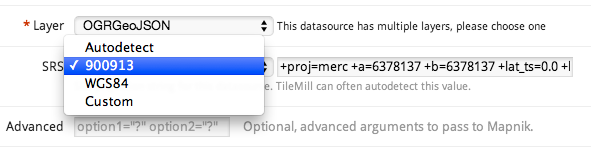
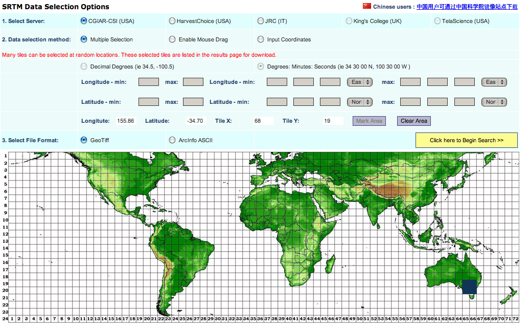
Salt, or SaltStack, is an automatic deployment tool for clusters of machines, in the same category as Chef, Puppet and Ansible. I’ve previously used Chef, found the experience frustrating, and thought I’d give Salt a go. The task: converting my tilemill-server bash scripts, which set up a complete TileMill server stack, with OpenStreetMap data, Nginx and a couple of other goodies.

The goals in this kind of automation for me are threefold:

  1. So I can quickly build new servers for Mapmaking for Academics workshops.
  2. So I can manage other, similar (but slightly different) servers, such as cycletour.org and gis.researchmaps.net. “Manage” here means documenting and controlling the slight configuration differences, being able to roll out further changes (such as web passwords) without having to log in.
  3. So other people can do this too. (That is, the solution has to be simple enough to explain that other people can do it).

The product of my labours: https://github.com/stevage/saltymill

Disclaimers and apologies

A week is too soon to feel the real benefits of automatic deployment and configuration management, but plenty long enough for frustrations and annoyances. There are lots of good things about Salt, but those will go in another post.

I’ve intentionally written this post as I go, to document things that are surprising, counter-intuitive or bothersome to the newcomer. Once you become familiar with a system, it’s much harder to remember what it was like as a newbie, and easier to make allowances for it. So experienced Salt users will probably rankle at the wilful ignorance displayed herein.

A few things I quickly appreciated, compared to Chef:

  • Two parties, not three. Chef has the client (your laptop), the Chef Server (which I never used because it was too complicated) and the target machine itself. Salt doesn’t have the client, so you do everything either on the master (“salt ‘*’ state.highstate) or on the target machine in masterless mode (“salt-call –local state.highstate)
  • No need for “knife upload”: the Salt Master just looks for your files in /srv/salt, so you can use any method you like for getting them there. I always hated having to upload recipes, environments etc individually – you always forgot something.
  • YAML rather than Ruby.
  • A nifty command line tool that lets you try states out on the fly, or run commands remotely on several servers at once. (Chef’s shell, formerly ‘shef’, never really worked out for me.)

Mediocre documentation

Automatic deployment systems are complicated, and you’d love some clear mental concepts to hang on to. Unfortunately, Salt’s chosen metaphor is pretty clumsy (salt grains, pillars, mines…meh), and they’re not well explained. Apparently the concept of a “state” is pretty important to Salt, but even after reading much documentation and quite a reasonable amount of hacking away, I still have only the vaguest notion of what a Salt state is. What’s a “high state”? A “low state”? How can I query the “state” of a minion? No idea. It’s hard to tell if “states” are an implementation magic that makes the whole thing work, or if I, the user am supposed to know about them.

(After more digging around, I think “state” has several meanings, of which one is just one of the actions defined in a SLS file.)

And then, strangely, how do you refer to the most important objects that you work with, the actual code that specifies what you want done? “SLS files”. Or “state files”. Or “SLS[es]”. Or “Salt States”. Or “Salt state files”. Those terms are all used in the docs. (I thought they were also called “formulas“, but those are apparently only pre-canned state files.)

YAML headaches

It turns out YAML has some weird indenting and formatting rules that occasionally ruin your day. Initially it’s especially tedious having to learn this extra language and its subtleties (> vs |, multi-line hyphenated lists versus single line square-bracketed lists) when you just want to get started – it steepens the learning curve.

IDs, names

The behaviour of statement IDs is cute at first, but not well explained, and becomes pretty tiresome. The idea is you can write this:

httpd:
  pkg.installed

Succinct, huh? That’s actually shorthand for this:

install_apache_please:
  pkg:
    - name: httpd
    - installed

That is, the “id” (httpd) is also the default value for “name”. Secondly, you can compress one item of the following list  (“installed”) onto the function name (“pkg”) with a dot.

So far, so good. But it quickly leads to this kind of silliness:

"{{ pillar.installdir}}/myfile.txt":
  file.managed:
    - unless: ...
another_command:  
cmd.wait: - watch: [ "{{ pillar.installdir}}/myfile.txt" ]

Free-text strings don’t make great IDs. On the whole, I’d prefer a syntax which is robustly readable and predictable, rather than one which is very succinct in special cases, but mostly less so.

The next problem is that all those IDs have to be unique across all your .sls files. That’s tedious when you have repetitious little actions that you can’t be bothered naming properly.

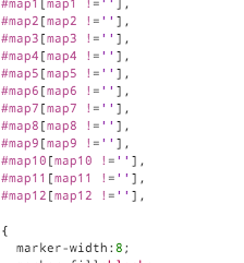
Another annoyance is that Salt’s data structure sometimes requires lists, and sometimes requires dicts, and it’s hard to remember which is which. For example:

finishlog:
  cmd.run:
    - name: |
        echo "All done! Enjoy your new server.<br/>" >> /var/log/salt/buildlog.html
  file.managed:
    - name: /var/log/salt/index.html
    - source: salt://initindex.html
    - template: jinja
    - context:
       buildtitle: "Your server is ready!"
       buildsubtitle: "Get in there and make something."
       buildtitlecolor: "hsl(130,70%,70%)"

Notice how the first level of indentation doesn’t have hyphens, the second level does, then the third level doesn’t? I’m not sure what the philosophy is here – it looks to me like each level is just a list of key/value pairs.

Jinja templating logic

Jinja is a fantastic templating language. But Salt uses this template language as its core programming logic. That’s like writing a C program using macros all over the place. It’s sort of ok as a way to access data values:

update_data:
 cmd.run:
 - cwd: {{ pillar['tm_dir'] }}

Here, the {{ … }} bit is a Jinja substitution, so the actual YAML code that gets parsed and executed looks like this:

update_data:
 cmd.run:
 - cwd: /mnt/saltymill

As most people who have dealt with macro preprocessors know, they rapidly get complex and very hard to debug. The error you see is a YAML parse error, but is the problem in your YAML code, or in what got substituted by Jinja?

It’s certainly possible to use the full range of Jinja functions (that is, {% … %} territory) inside Salt formulas, but for sanity I’m trying to avoid it. On the flip side, certain things that I expected to be easy, like defining a variable in a state {% set foo = blah %} and then being able to access it from inside any other template, turn out to not work. You need to explicitly pass context variables around, or import state files, and it becomes quite cumbersome.

Help may be at hand.  Evan Borgstrom also noticed that “simple readability of YAML starts to get lost in the noise of the Jinja syntax” and is working on a new, pure Python syntax called NaCl.

Many ordering options

There are about 4 competing systems simultaneously operating to determine which order actions get executed in, ranked here from most important to least important.

  1. Requisite order: The “preferred”, declarative system, where if X requires Y and Z requires X, then Salt just figures out that Y has to happen first.
  2. Explicit order: you can set an “order flag” on an action, like “order: 1” or “order: last”. Basically, if you’re tearing your hair out with desperation, I think. (I tried it once, and it seemed to have no effect.)
  3. Definition order: things happen in the order they’re declared in. (By far my preferred option). This doesn’t always seem to work, in the top.sls, for reasons I don’t understand.
  4. Lexicographical order (yes, really): actions are executed in alphabetical order of their state name. (Apparently this was a good thing because at least it was consistent across platforms.)

The requisite ordering system sounds good, but in practice it has two shortcomings:

  1. Repetitiveness: let’s say you have psql 10 commands that all strictly depend on Postgresql being installed. It’s very repetitive to state that dependency explicitly, and much more efficient to simply install Postgresql at the top of the formula, and assume its existence thereafter.
  2. Scope: Requiring actions in other files seems to prevent the running of just this file. That is, if in load_db.sls you do “require: [ cmd: install_postgres ]”, then this command line no longer works: salt ‘*’ state.sls load_db

I’m yet to see any advantages to a declarative style. I like the certainty of knowing that a given sequence of steps works. The declarative model implies that one day the steps might be rearranged based only on my statement of what the dependencies are.

Arbitrary rules

There’s a rule that says you can’t have the same kind of state multiple times in a statement. This is invalid:

/var/log/salt/buildlog.html:
 file.managed:
 - source: salt://initlog.html 
 file.append:
 - text: Commencing build...

Why? I don’t know. The rules dictate that you have to do this:

/var/log/salt/buildlog.html:
 file.managed:
 - source: salt://initlog.html 

append_to_that_file:
 file.append:
 - name: /var/log/salt/buildlog.html
 - text: Commencing build...

Notice the cascade of consequences as this fragile “readability” tower crashes down:

  1. You can’t have two states of the same type in a statement, so we move the second state to a new statement; but:
  2. You can’t have two statements with the same ID, so we give the second statement a new ID; meaning:
  3. We now have to explicitly define the “name” of the file.append function.

Clumsy bootstrapping

I miss Chef’s elegant “knife bootstrap” though. In one command line command, Chef:

  1. Defines properties about the node, like its environment and role.
  2. Connects to the node
  3. Installs Chef
  4. Registers the node with the Chef server, or your client, or both.
  5. Starts a deployment, as required.

With Salt, these all seem to be manual steps:

  1. I SSH to the node
  2. I download and install Salt (using one-liner bootstrap script)
  3. I write ‘grains’ to the newly created /etc/salt/grains file (yes, I think I’m doing this wrong – roles should be defined through pillars maybe)
  4. The node then attempts to register itself with the Salt Master, but because the connection is insecure:
  5. I have to go to the Salt Master and accept the pending key: yes | salt-key -A [and the docs suggest you’re supposed to manually verify the keys!]
  6. Now I can launch a deployment: salt-master <nodename> state.highstate

When I rebuild a server, the above are preceded by these steps:

  1. Log in to OpenStack Dashboard, click ‘rebuild’ on the instance.
  2. Edit my ~/.ssh/known_hosts to remove the old SSH key.
  3. On the Salt Master, delete the old key: yes | salt-key <node> -d

There are probably ways of streamlining this process. I hope so, anyway, because it’s pretty clumsy. I don’t know yet whether the SaltMaster can automatically launch deployments when new nodes register.
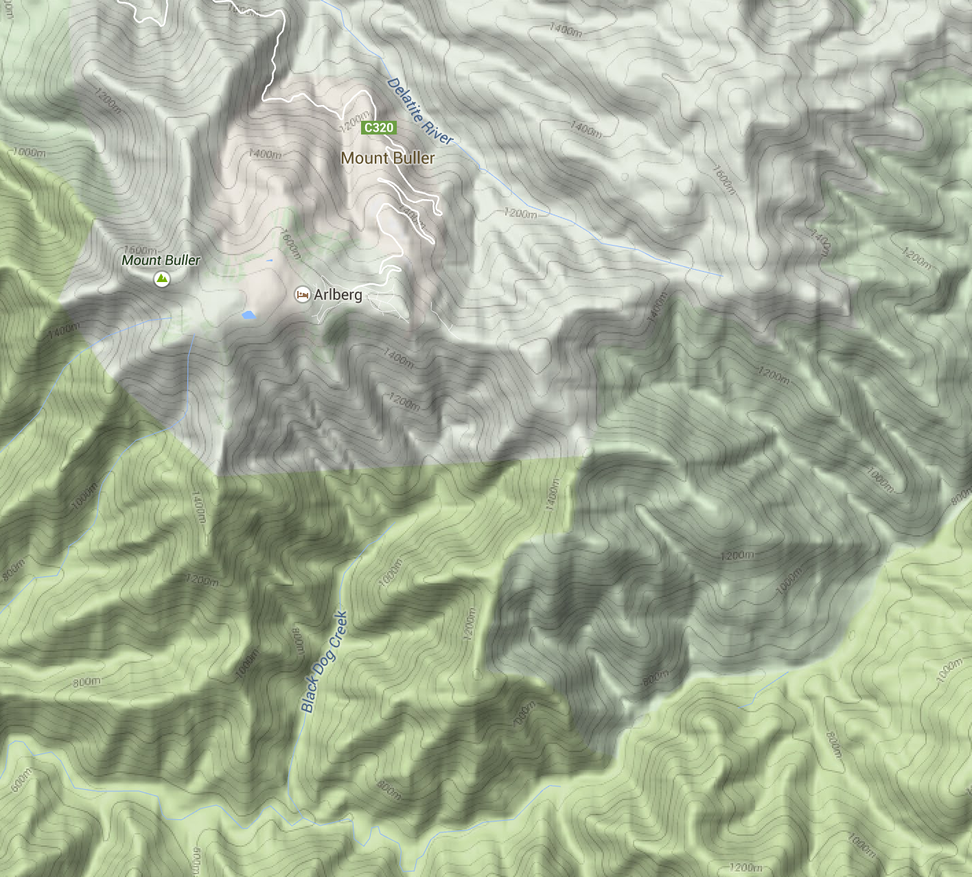
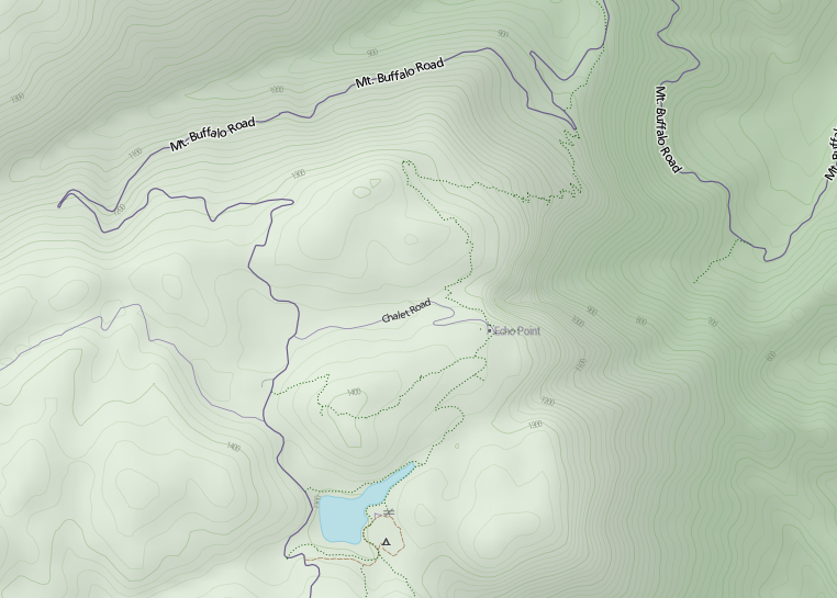
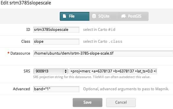
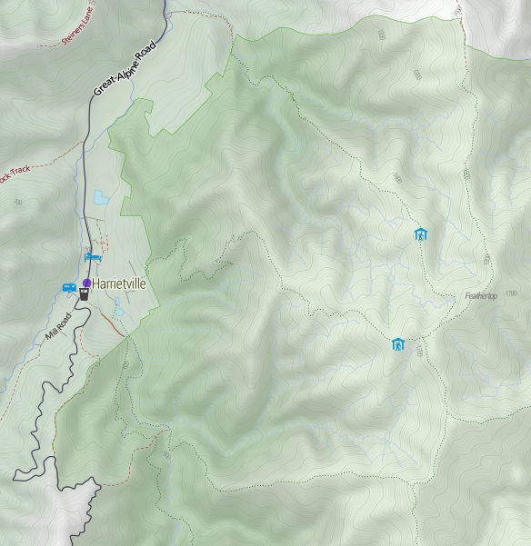
Terrain in TileMill: a walkthrough for non-GIS types

I created a basemap for http://cycletour.org with TileMill and OpenStreetMap. It looked…ok.

Image

But it felt like there was something missing. Terrain. Elevation. Hills. Mountains. I’d put all that in the too hard basket, until a quick google turned up two blog posts from MapBox, the wonderful people who make TileMill. “Working with terrain data” and “Using TileMill’s raster-colorizer“. Putting these two together, plus a little OCD, led me to this:

Image

Slight improvement! Now, I felt that the two blog posts skipped a couple of little steps, and were slightly confusing on the difference between the two approaches, so here’s my step by step. (MapBox, please feel free to reuse any of this content.)

My setup is an 8 core Ubuntu VM with 32GB RAM and lots of disk space. I have OpenStreetMap loaded into PostGIS.

1. Install the development version of TileMill

You need to do this if you want to use the raster-colorizer. You want this while developing your terrain style, if you want the “snow up high, green valleys below” look. Without it, you have to pre-render the elevation color effect, which is time consuming. If you want to tweak anything (say, to move the snow line slightly), you need to re-render all the tiles.

Fortunately, it’s pretty easy.

  1. Get the “install-tilemill” gist (my version works slightly better)
  2. Probably uncomment the mapnik-from-source line (and comment out the other one). I don’t know whether you need the latest mapnik.
  3. Run it. Oh – it will uninstall your existing TileMill. Watch out for that.
  4. Reassemble stuff. The dev version puts projects in ~/Documents/<username/MapBox/project which is weird.

2. Get some terrain data.

The easiest place is the ubiquitous NASA SRTM DEM (digital elevation model) data. You get it from CGIAR. The user interface is awful. You can only download pieces that are 5 degrees by 5 degrees, so Victoria is 4 pieces.

Screen shot 2013-09-11 at 10.46.00 PM

If you’re downloading more than about that many, you’ll probably want to automate the process. I wrote this quick script to get all the bits for Australia:

for x in {59..67}; do
for y in {14..21}; do
echo $x,$y
if [ ! -f srtm_${x}_${y}.zip ]; then
wget http://droppr.org/srtm/v4.1/6_5x5_TIFs/srtm_${x}_${y}.zip
else
echo "Already got it."
fi
done
done
unzip '*.zip'


3. Process SRTM .tifs with GDAL.

To have any fun with terrain mapping in TileMill, you need to produce separate layers from the terrain data:

  1. The heightmap itself, so you can colour high elevations differently from low ones.
  2. A “hillshading” layer, where southeast facing slopes are dark, and northwest ones are light. This is what produces the “terrain” illusion.
  3. A “slopeshading” layer, where steep slopes (regardless of aspect) are dark. I’m ambivalent about how useful this is, but you’ll want to play with it.
  4. Contours. These can make your map look AMAZING.
Screen shot 2013-09-11 at 10.53.41 PM

Contours – they’re the best.

In addition, you’ll need some extra processing:

  1. Merge all the .tif’s into one. (I made the mistake of keeping them separate, which makes a lot of extra layers in TileMill). Because they’re GeoTiffs, GDAL can magically merge them without further instruction.
  2. Re-project it (converting it from some random ESPG to Google Web Mercator – can you tell I’m not a real GIS person?)
  3. A bit of scaling here and there.
  4. Generating .tif “overviews”, which are basically smaller versions of the tifs stored inside the same file, so that TileMill doesn’t explode.

Hopefully you already have GDAL installed. It probably came with the development version of TileMill.

Here’s my script for doing all the processing:

#!/bin/bash
echo -n "Merging files: "
gdal_merge.py srtm_*.tif -o srtm.tif
f=srtm
echo -n "Re-projecting: "
gdalwarp -s_srs EPSG:4326 -t_srs EPSG:3785 -r bilinear $f.tif $f-3785.tif

echo -n "Generating hill shading: "
gdaldem hillshade -z 5 $f-3785.tif $f-3785-hs.tif
echo and overviews:

gdaladdo -r average $f-3785-hs.tif 2 4 8 16 32
echo -n "Generating slope files: "
gdaldem slope $f-3785.tif $f-3785-slope.tif
echo -n "Translating to 0-90..."
gdal_translate -ot Byte -scale 0 90 $f-3785-slope.tif $f-3785-slope-scale.tif
echo "and overviews."
gdaladdo -r average $f-3785-slope-scale.tif 2 4 8 16 32
echo -n Translating DEM...
gdal_translate -ot Byte -scale -10 2000 $f-3785.tif $f-3785-scale.tif
echo and overviews.
gdaladdo -r average $f-3785-scale.tif 2 4 8 16 32
#echo Creating contours
gdal_contour -a elev -i 20 $f-3785.tif $f-3785-contour.shp

Take my word for it that the above script does everything I promise. The options I’ve chosen are all pretty standard, except that:

  • I’m exaggerating the hillshading by a factor of 5 vertically (“-z 5”). For no particularly good reason.
  • Contours are generated at 20m intervals (“-i 20”).
  • Terrain is scaled in the range -10 to 2000m. Probably an even lower lower bound would be better (you’d be surprised how much terrain is below sea levels – especially coal mines.) Excessively low terrain results in holes that can’t be styled and turn up white.

4. Load terrain layers into TileMill

Now you have four useful files, so create layers for them. I’d suggest creating them as layers in this order (as seen in TileMill):

  1. srtm-3785-contour.shp – the shapefile containing all the contours.
  2. srtm-3785-hs.tif – the hillshading file.
  3. srtm-3785-slope-scale.tif – the scaled slope shading file.
  4. srtm-3785.tif – the height map itself. (I also generate srtm-3785-scale.tif. The latter is scaled to a 0-255 range, while the former is in metres. I find metres makes more sense.)

For each of these, you must set the projection to 900913 (that’s how you spell GOOGLE in numbers). For the three ‘tifs’, set band=1 in the “advanced” box. I gather that GeoTiffs can have multiple bands of data, and this is the band where TileMill expects to find numeric data to apply colour to.

Screen shot 2013-09-11 at 11.06.39 PM

5. Style the layers

Mapbox’s blog posts go into detail about how to do this, so I’ll just copy/paste my styles. The key lessons here are:

  • Very slight differences in opacity when stacking terrain layers make a huge impact on the appearance of your map. Changing the colour of a road doesn’t make that much difference, but with raster data, a slight change can affect every single pixel.
  • There are lots of different raster-comp-ops to try out, but ‘multiply’ is a good default. (Remember, order matters).
  • Carefully work out each individual zoom level. It seems to work best to have hillshading transition to contours around zoom 12-13. The SRTM data isn’t detailed enough to really allow hillshading above zoom 13

My styles:

.hs[zoom <= 15] {
[zoom>=15] { raster-opacity: 0.1; }
[zoom>=13] { raster-opacity: 0.125; }
[zoom=12] { raster-opacity:0.15;}
[zoom<=11] { raster-opacity: 0.12; }
[zoom<=8] { raster-opacity: 0.3; }

raster-scaling:bilinear;
raster-comp-op:multiply;
}

// not really convinced about the value of slope shading
.slope[zoom <= 14][zoom >= 10] {
raster-opacity:0.1;
[zoom=14] { raster-opacity:0.05; }
[zoom=13] { raster-opacity:0.05; }
raster-scaling:lanczos;
raster-colorizer-default-mode: linear;
raster-colorizer-default-color: transparent;

// this combo is ok
raster-colorizer-stops:
stop(0, white)
stop(5, white)
stop(80, black);
raster-comp-op:color-burn;

}

// colour-graded elevation model
.dem {
[zoom >= 10] { raster-opacity: 0.2; }
[zoom = 9] { raster-opacity: 0.225; }
[zoom = 8] { raster-opacity: 0.25; }
[zoom <= 7] { raster-opacity: 0.3; }
raster-scaling:bilinear;
raster-colorizer-default-mode: linear;
raster-colorizer-default-color: hsl(60,50%,80%);
// hay, forest, rocks, snow

// if using the srtm-3785-scale.tif file, these stops should be in the range 0-255.
raster-colorizer-stops:
stop(0,hsl(60,50%,80%))
stop(392,hsl(110,80%,20%))
stop(785,hsl(120,70%,20%))
stop(1100,hsl(100,0%,50%))
stop(1370,white);
}
.contour[zoom >=13] {
line-smooth:1.0;
line-width:0.75;
line-color:hsla(100,30%,50%,20%);
[zoom = 13] {
line-width:0.5;
line-color:hsla(100,30%,50%,15%);
}

[zoom >= 16],
[elev =~ “.*00”] {
l/text-face-name:’Roboto Condensed Light’;
l/text-size:8;
l/text-name:'[elev]’;
[elev =~ “.*00”] { line-color:hsla(100,30%,50%,40%); }
[zoom >= 16] { l/text-size: 10; }
l/text-fill:gray;
l/text-placement:line;
}
}

And finally a gratuitous shot of Mt Feathertop, showing the major approaches and the two huts: MUMC Hut to the north and Federation Hut further south. Terrain is awesome!

Screen shot 2013-09-11 at 11.25.23 PM

A TileMill server with all the trimmings

Recently, I set up a server for a series of #datahack workshops. We used TileMill to make creative maps with OpenStreetMap and other available data.

The major pieces required are:

  • TileMill, which comes with its own installer, and is totally self-sufficient: web application server, Mapnik, etc.
  • Postgres, the database which will hold the OSM data
  • PostGIS, the extension which allow Postgres to do that
  • Nginx, a reverse proxy, so we can have some basic security (TileMill comes with none)
  • OSM2PGSQL, a tool for loading OSM data into PostGIS

I’ve captured all those bits, and their configuration in this script. You’ll probably want to change the password – search for “htpasswd”.

The script below is out of date, contains errors, and is not maintained. Go to:

http://github.com/stevage/saltymill

# This script installs TileMill, PostGIS, nginx, and does some basic configuration.
# The set up it creates has basic security: port 20009 can only be accessed through port 80, which has password auth.

# The Postgres database tuning assumes 32 Gb RAM.

# Author: Steve Bennett

wget https://github.com/downloads/mapbox/tilemill/install-tilemill.tar.gz
tar -xzvf install-tilemill.tar.gz

sudo apt-get install -y policykit-1

#As per https://github.com/gravitystorm/openstreetmap-carto

sudo bash install-tilemill.sh

#And hence here: http://www.postgis.org/documentation/manual-2.0/postgis_installation.html
#? 
sudo apt-get install -y postgresql libpq-dev postgis

# Install OSM2pgsql

sudo apt-get install -y software-properties-common git unzip
sudo add-apt-repository ppa:kakrueger/openstreetmap
sudo apt-get update
sudo apt-get install -y osm2pgsql

#(leave all defaults)

#Install TileMill

sudo add-apt-repository ppa:developmentseed/mapbox
sudo apt-get update

sudo apt-get install -y tilemill

# less /etc/tilemill/tilemill.config
# Verify that server: true

sudo start tilemill

# To tunnel to the machine, if needed:
# ssh -CA nectar-maps -L 21009:localhost:20009 -L 21008:localhost:20008
# Then access it at localhost:21009

# Configure Postgres

echo "CREATE ROLE ubuntu WITH LOGIN CREATEDB UNENCRYPTED PASSWORD 'ubuntu'" | sudo -su postgres psql
# sudo -su postgres bash -c 'createuser -d -a -P ubuntu'

#(password 'ubuntu') (blank doesn't work well...)

# === Unsecuring TileMill

export IP=`curl http://ifconfig.me`

cat > tilemill.config <<FOF
{
  "files": "/usr/share/mapbox",
  "coreUrl": "$IP:20009",
  "tileUrl": "$IP:20008",
  "listenHost": "0.0.0.0",
  "server": true
}
FOF
sudo cp tilemill.config /etc/tilemill/tilemill.config

# ======== Postgres performance tuning
sudo bash
cat >> /etc/postgresql/9.1/main/postgresql.conf <<FOF
# Steve's settings
shared_buffers = 8GB
autovaccuum = on
effective_cache_size = 8GB
work_mem = 128MB
maintenance_work_mem = 64MB
wal_buffers = 1MB

FOF
exit

# ==== Automatic start 
cat > rc.local <<FOF
#!/bin/sh -e
sysctl -w kernel.shmmax=8000000000
service postgresql start
start tilemill
service nginx start
exit 0
FOF

sudo cp rc.local /etc/rc.local

# === Securing with nginx
sudo apt-get -y install nginx

cd /etc/nginx
sudo bash
printf "maps:$(openssl passwd -crypt 'incorrect cow cell pin')\n" >> htpasswd
chown root:www-data htpasswd
chmod 640 htpasswd
exit

cat > sites-enabled-default <<FOF

server {
   listen 80;
   server_name localhost;
   location / {
        proxy_set_header Host \$http_host;
        proxy_pass http://127.0.0.1:20009;
        auth_basic "Restricted";
        auth_basic_user_file htpasswd;
    }
}

server {
   listen $IP:20008;
   server_name localhost;
   location / {
        proxy_set_header Host $http_host;
        proxy_pass http://127.0.0.1:20008;
        auth_basic "Restricted";
        auth_basic_user_file htpasswd;
    }
}

FOF

sudo cp sites-enabled-default /etc/nginx/sites-enabled/default
sudo service nginx restart

echo "Australia/Melbourne" | sudo tee /etc/timezone
sudo dpkg-reconfigure --frontend noninteractive tzdata