Steve Bennett blogs

…about maps, open data, Git, and other tech.

Tag Archives: open data

Your own personal National Map with TerriaJS: no coding and nothing to deploy

National Map is a pretty awesome place to find geospatial open data from all levels of Australian government.  (Disclaimer: I work on it at NICTA). But thanks to some not-so-obvious features in TerriaJS, the software that drives it, you can actually create and share your own private version with your own map layers – without programming, and without deploying any code.

What you get:

  • A 3D, rotateable, zoomable globe, thanks the awesome Cesium library. (It seamlessly falls back to Leaflet if 3D isn’t available.)
  • Selectable layers, grouped into an organised hierarchy of your devising
  • Support for a wide range of spatial services: WMS, WFS, ESRI (both catalogs and individual layers for all of these), CKAN, individual files like GeoJSON and KML, and even CSV files representing regions like LGAs, Postcodes, States…
  • Choose your own basemap, initial camera position, styling for some spatial types, etc.

1. Make your own content with online tools

Want to create your own spatial layer – polygons, lines and points? Use geojson.io and choose Save > Gist to save the result to Github Gist. (Gist is just a convenient service that stores text on the web for free).

Screenshot 2015-07-02 07.56.52

How about a layer of data about suburbs by postcode? Create a Google Sheet that follows the csv-au-geo specification (it’s easy!), download as CSV, paste it into a fresh Gist.

Screenshot 2015-07-02 08.02.28

2. Create a catalog with the Data Source Editor

Using the new TerriaJS Data Source Editor (I made this!), create your new catalog. You’re basically writing a JSON file but using a web form (thanks json-editor!) to do it.

To add one of your datasources on Gist, make sure you link to the Raw view of the page:

Screenshot 2015-07-02 08.07.02

Screenshot 2015-07-02 08.08.16

Don’t forget to select the type for each file: GeoJSON, CSV, etc.

3. Add more data

You might want to bring in some other data sources that you found on National Map. This can be a little tricky – there’s a lot of complexity in accessing data sources that National Map hides for you.

But here’s roughly how to go about it for a WMS (web map service) data source.

In the layer’s info window, grab the WMS URL

Screenshot 2015-07-02 10.53.13

You’ll need to put “http://nationalmap.gov.au/proxy/” in front of a some layers, because their WMS servers don’t support CORS.

You’ll also need the value of the “Layer name” field. (For Esri layers you need to dig a bit further.)

Screenshot 2015-11-13 11.10.55

(Yes, this layer is called “2”)

Add a WMS layer, and add “Layers Names” as an additional property. So it looks like this:

Screenshot 2015-07-02 10.55.54

4. Tweak your presentation

You can add extra properties to layers to fine tune their appearance. For example, for our CSV dataset:

Screenshot 2015-07-02 10.57.49

You might want to set “Is Enabled” and “Is Shown” on every layer so they display automatically.

And finally, you might want to set an initial camera and base map, so the view doesn’t start off the west coast of Africa with a satellite view.

Screenshot 2015-07-02 10.39.55

5. Save and preview

Screenshot 2015-07-02 10.46.41

As you make changes, click “Save to Gist” to save your configuration file to a secret location on Gist. You can then click “Preview your changes in National Map”.

Screenshot 2015-07-02 11.01.19

Make a note of the Gist link so you can keep working on it in the future. You can’t modify an existing configuration, but you can load from there and save a new copy.

6. Share!

Now you have a long URL like this: http://nationalmap.research.nicta.com/#clean&https%3A%2F%2Fgist.githubusercontent.com%2Fanonymous%2Fc3f181ca742b9ed94fe4%2Fraw%2F10853f7d8bb33610e4f2ce26947eaf6882192957%2Fdatasource.json

So, use tinyurl.com or another URL shortening service to get something more useful:

http://tinyurl.com/myawsummap

After the hackathon: 4 classic recipes

CC BY-ND 2.0, NAIT.

Everyone loves hackathons. And almost as much, everyone loves asking “but what happens to the projects afterwards?” There’s more than one route to follow. I’d like to propose four standard recipes we can use to describe the prospects of each project.

#1: Start-up

The creators of the hack could form a business. The developers work very hard to polish up what they’ve written until it’s a viable product ready for the marketplace, and then try to build a start-up around it while probably looking for external funding.

Snap Send Solve - hackathon to start-up success story

Snap Send Solve – hackathon to start-up success story

This kind of result is very desirable for hackathon organisers because there is such a clear story of benefits and outcomes: “a few thousand dollars of sponsorship paid for a weekend hackathon which led to this $50 million start-up which makes the app your grandma uses, which is great for the economy”.

Ingredients required: Start-up mentors, entrepreneurs, a business focus from the get-go

#2: Government app

OpenBinMap.org - a government app in waiting?

OpenBinMap.org – a government app in waiting?

If you make an interesting and useful app with a government body’s data, then maybe they’d like to take it on board. They might use the code base, but it’s probably better to use the concept and vision and write the code from scratch. Imagination isn’t a government strong suit, but once they see something they like, they’re pretty good at saying “we need one of those”.

This also doesn’t seem to happen very often, but can we try harder? We should follow GovHack up with serious discussions between hack developers and the government bodies that sponsored them. Following my cheeky “CanIBoatHere.com” category winner last year, I did meet with Transport Safety Victoria, but didn’t really have the time or motivation to pursue it. But they were very keen, so why couldn’t we have made it work? Similarly, there was potentially money available from the Victorian Technology Innovation Fund to support GovHack projects, but no clear process meant that months of fumbling through paperwork might eventually lead to nothing. Not so appealing to developers.

Ingredients needed: A solid process, government/developer wranglers, pre-commitment to funding.

#3: Community project

Eventable would make a great community project.

Eventable would make a great community project.

If a hack is interesting and important enough to other developers, could it become a self-sustaining open source project? The idea seems plausible, but I don’t know if I’ve seen it happen. The major blockers are the hackish quality of the code itself which typically would require a major rewrite, and the sense that the weekend was fun, and this would be a lot of work. Hacks are a kind of showy facade. Once developers sit down to talk seriously about onward development, all kinds of serious difficulties start to emerge. And between the end of the weekend and the announcement of prizes a lot of momentum gets lost which can be hard to start up again.

Ingredients needed: Post-hackathon events to explore projects and establish communities.

#4: Story

Living, Breathing Melbourne - still just a story.

Living, Breathing Melbourne – still just a story.

And finally, let’s acknowledge that the most important part of many hacks is their potential as an interesting story in their own right. Anthony Mockler’s GovHack 2012 entry “Is your Pollie Smarter than a Fith Grader” isn’t a failure because it didn’t lead to a start up – it was a great story that captured a lot of attention. My team’s 2014 entry “Living, Breathing Melbourne” has been frequently referred to as a model for actual open data dashboards, even though we didn’t develop it further. We should try to extract as much value as possible from these stories, and preserve their essence, even if only in screenshots and blog posts.

Ingredients needed: Story tellers, blog posts, active engagement with journalists

In summary

Let’s think of these different paths early on when discussing projects: “This would make a great community project“, “I don’t see this going anywhere, but let’s get the story out”, “It would be a shame if the department doesn’t take this on as a government app“. And don’t write off a hack just because it didn’t fit into the mould you were thinking of.

OpenTrees.org: how to aggregate 373,000 trees from 9 open data sources

I try to convince government bodies, especially local councils, to publish more open data. It’s much easier when there is a concrete benefit to point to: if you publish your tree inventory, it could be joined up with all the other councils’ tree inventories, to make some kind of big tree-explorey interface thing.

Introducing: opentrees.org. It’s fun! Click on “interesting trees”, hover over a few, and click on the ones that take your fancy. You can play for ages.

Here’s how I made it.

First you get the data

Through a bit of searching on data.gov.au, I found tree inventories (normally called “Geelong street trees” or similar) for: Geelong, Ballarat (both participating in OpenCouncilData), Corangamite (I visited last year), Colac-Otways (friends of Corangamite), Wyndham (a surprise!), Manningham (total surprise). It showed two results from data.sa.gov.au: Adelaide, and the Waite Arboretum (in Adelaide). Plus the City of Melbourne’s (open data pioneers) “Urban Forest” dataset on data.melbourne.vic.gov.au.

Every dataset is different. For instance:

  • GeoJSON’s for Corangamite, Colac-Otways, Ballarat, Manningham
  • CSV for Melbourne and Adelaide. Socrata has a “JSON” export, but it’s not GeoJSON.
  • Wyndham has a GeoJSON, but for some reason the data is represented as “MultiPoint”, rather than “Point”, which GDAL couldn’t handle. They also have a CSV, which are also very weird, with an embedded WKT geometry (also MULTIPOINT), in a projected (probably UTM) format. There are also several blank columns.
  • Waite Arboretum’s data is in zipped Shapefile and KML. KML is the worst, because it seems to have attributes encoded as HTML, so I used the Shapefile.

Source code for gettrees.sh.

Tip for data providers #1: Choose CSV files for all point data, with columns “lat” and “lon”. (They’re much easier to manipulate than other formats, it’s easy to strip fields you don’t need, and they’re useful for doing non-spatial things with.)

Then you load the data

Next we load all the data files, as they are, into separate tables in PostGIS. GDAL is the magic tool here. Its conversion tool, ogr2ogr, has a slightly weird command line but works very well. A few tips:

  • Set the target table geometry type to be “GEOMETRY”, rather than letting it choose a more specific type like POINT or MULTIPOINT. This makes it easier to combine layers later.
    -nlt GEOMETRY
  • Re-project all geometry to Web Mercator (EPSG:3857) when you load. Save yourself pain.
    -t_srs EPSG:3857
  • Load data faster by using Postgres “copy” mode:
    –config PG_USE_COPY YES
  • Specify your own table name:
    -nln adelaide

Tip for data providers #2: Provide all data in unprojected (latitude/longitude) coordinates by preference, or Web Mercator (EPSG:3857).

CSV files unfortunately require creating a companion ‘.vrt’ file for non-trivial cases (eg, weird projections, weird column names). For example:
<OGRVRTDataSource>
<OGRVRTLayer name="melbourne">
<SrcDataSource>melbourne.csv</SrcDataSource>
<GeometryType>wkbPoint</GeometryType>
<LayerSRS>WGS84</LayerSRS>
<GeometryField encoding="PointFromColumns" x="Longitude" y="Latitude"/>
</OGRVRTLayer>
</OGRVRTDataSource>

The command to load a dataset looks like:
ogr2ogr --config PG_USE_COPY YES -overwrite -f "PostgreSQL" PG:"dbname=trees" -t_srs EPSG:3857 melbourne.vrt -nln melbourne -lco GEOMETRY_NAME=the_geom -lco FID=gid -nlt GEOMETRY
Source code for loadtrees-db.sh.

Merge the data

Unfortunately most councils do not yet publish data in the (very easy to follow!) opencouncildata.org standards. So we have to investigate the data and try to match the fields into the scheme. Basically, it’s a bunch of hand-crafted SQL INSERT statements like:
INSERT INTO alltrees (the_geom, ref, genus, species, scientific, common, location, height, crown, dbh, planted, maturity, source)
SELECT the_geom,
tree_id AS ref,
genus_desc AS genus,
spec_desc AS species,
trim(concat(genus_desc, ' ', spec_desc)) AS scientific,
common_nam AS common,
split_part(location_t, ' ', 1) AS location,
height_m AS height,
canopy_wid AS crown,
diam_breas AS dbh,
CASE WHEN length(year_plant::varchar) = 4 THEN to_date(year_plant::varchar, 'YYYY') END AS planted,
life_stage AS maturity,
'colac_otways' AS source
FROM colac_otways;

Notice that we have to convert the year (“year_plant”) into an actual date. I haven’t yet fully handled complicated fields like health, structure, height and dbh, so there’s a mish-mash of non-numeric values, different units (Adelaide records the circumference of trees rather than diameter!)

Tip for data providers #3: Follow the opencouncildata.org standards, and participate in the process.

Source code for mergetrees.sql

Clean the data

We now have 370,000 trees but it’s of very variable quality. For instance, in some datasets, values like “Stump”, “Unknown” or “Fan Palm” appear in the “scientific name” column. We need to clean them out:
UPDATE alltrees
SET scientific='', genus='', species='', description=scientific
WHERE scientific='Vacant Planting'
OR scientific ILIKE 'Native%'
OR scientific ILIKE 'Ornamental%'
OR scientific ILIKE 'Rose %'
OR scientific ILIKE 'Fan Palm%'
OR scientific ILIKE 'Unidentified%'
OR scientific ILIKE 'Unknown%'
OR scientific ILIKE 'Stump';

We also want to split scientific names into individual genus and species fields, handle varieties, sub-species and so on. Then there are the typos which, due to some quirk in tree management software, become faithfully and consistently retained across a whole dataset. This results in hundreds of Angpohoras, Qurecuses, Botlebrushes etc. We also need to turn non-values (“Not assessed”, “Unknown”, “Unidentified”) into actual NULL values.
UPDATE alltrees
SET crown=NULL
WHERE crown ILIKE 'Not Assessed';

Source code for cleantrees.sql

Tip for data providers #4: The cleaner your data, the more interesting things people can do with it. (But we’d rather see dirty data than nothing.)

Make a map

I use TileMill to make web maps. For this project it has a killer feature: the ability to pre-render a map of hundreds of thousands of points, and allow the user to interact with those points, without exploding the browser. That’s incredibly clever. Having complete control of the cartography is also great, and looks much better than, say, dumping a bunch of points on a Google Map.

As far as TileMill maps goes, it’s very conventional. I add a PostGIS layer for the tree points, plus layers for other features such as roads, rivers and parks, pointing to an OpenStreetMap database I already had loaded. Also show the names of the local government areas with their boundaries, which fade out and disappear as you zoom in.

My style is intentionally all about the trees. There are some very discreet roads and footpaths to serve as landmarks, but they’re very subdued. I use colour (from green to grey) to indicate when species and/or genus information is missing. The Waite Arboretum data has polygons for (I presume) crown coverage, which I show as a semi-opaque dark green.

OpenTrees.org TileMill screenshot


Source code for the TileMill CartoCSS style.

There’s also an interactive layer, so the user can hover over a tree to see more information. It looks like this:
<b>{{{common}}} <i>{{{scientific}}}</i></b>
<br/>
<table>
{{#genus}}<tr><th>Genus </th><td>{{{genus}}}</td></tr>{{/genus}}
{{#species}}<tr><th>Species</th><td>{{{species}}}</td></tr>{{/species}}
{{#variety}}<tr><th>Variety</th><td>{{{variety}}}</td></tr>{{/variety}}

...
I also whipped up two more layers:

  1. OpenStreetMap trees, showing “natural=tree” objects in OpenStreetMap. The data is very sketchy. This kind of data is something that councils collect much better than OpenStreetMap.
  2. Interesting trees. I compute the “interestingness” of a tree by calculating the number of other trees in the total database of the same species. A tree in a set of 5 or less is very interesting (red), 25 or less is somewhat interesting (yellow).

Source code for makespecies.sql.

Build a website

It’s very easy to display a tiled, interactive map in a browser, using Leaflet.JS and Mapbox’s extensions. It’s a lot more work to turn that into an interesting website. A couple of the main features:

  • The base CSS is Twitter Bootstrap, mostly because I don’t know any better.
  • Mapbox.js handles the interactivity, but I intercept clicks (map.gridLayer.on) to look up the species and genus on Wikipedia. It’s straightforward using JQuery but I found it fiddly due to unfamiliarity. The Wikipedia API is surprisingly rough, and doesn’t have a proper page of its own – there’s the MediaWiki API page, the Wikipedia API Sandbox, and this useful StackOverflow question which that community helpfully shut down as a service to humanity.
  • To make embedding the page in other sites (such as Open Council Data trees) work better, the “?embed” URL parameter hides the titlebar.
  • You can go straight to certain councils with bookmarks: opentrees.org/#adelaide
  • I found the fonts (the title font is “Lancelot“) on Adobe Edge.
  • The header background combines the forces of subtlepatterns.com and px64.net.

Source code for treesmap.html, treesmap.js, treesmap.css.

And of course there’s a server component as well. The lightweight tilelive_server, written mostly by Yuri Feldman, glues together the necessary server-side bits of MapBox’s technology. I pre-generate a large-ish chunk of map tiles, then the rest are computed on demand. This bit of nginx code makes that work (well, after tilelive_server generated 404s appropriately):
location /treetiles/ {
# Redirect to TileLive. If tile not found, redirect to TileMill.
rewrite_log on;
rewrite ^.*/(\d+)/(\d+)/(\d+.*)$ /supertrees_c8887d/$1/$2/$3 break;

proxy_intercept_errors on;
error_page 404 = @dynamictiles;
proxy_set_header Host $http_host;
proxy_pass http://127.0.0.1:5044;

proxy_cache my-cache;
}

location @dynamictiles {
rewrite_log on;
rewrite ^.*/(\d+)/(\d+)/(\d+.*)$ /tile/supertrees/$1/$2/$3 break;
proxy_pass http://guru.cycletour.org:20008;
proxy_cache my-cache;
}

Too hard basket

A really obvious feature would be to show native and introduced species in different colours. Try as I might, I could not find any database with this information. There are numerous online plant databases, but none seemed to have this information in a way I could access. If you have ideas, I’d love to hear from you.

It would also be great to make a great mobile app, so you can easily answer the question “what is this tree in front of me”, and who knows what else.

In conclusion

Dear councils,

  Please release datasets such as tree inventories, garbage collection locations and times, and customer service centres, following the open standards at opencouncildata.org. We’ll do our best to make fun, interesting and useful things with them.

Love,

The open data community

Cycletour.org: a better map for Australian cycle tours

Cycletour.org is a tool for planning cycle tours in Australia, and particularly Victoria. I made it because Google Maps is virtually useless for this: poor coverage in the bush and inappropriate map styling make cycle tour planning a very frustrating experience.

Let’s say we want to plan a trip from Warburton to Stratford, through the hills. This is what Google Maps with “bicycling directions” offers:

Google Maps - useless for planning cycle tours.

Google Maps – useless for planning cycle tours.

Very few roads are shown at this scale. Unlike motorists, we cyclists want to travel long distances on small roads. A 500 kilometre journey on narrow backstreets would be heaven on a bike, and a nightmare in a car. So you need to see all those roads when zoomed out.

Worse, small towns such as Noojee, Walhalla and Woods point are completely missing!

Enter Cycletour.org:

Screenshot 2015-01-09 18.03.59

You can plan a route by clicking a start and end, then dragging the route around:

Screenshot 2015-01-13 23.43.12

It doesn’t offer safe or scenic route selection. The routing engine (OSRM) just picks the fastest route, and doesn’t take hills into account. You can download your route as a GPX file, or copy a link to a permanent URL.

Cartography

The other major features of cycletour.org’s map style are:

Screenshot 2015-01-09 18.12.04Bike paths are shown prominently. Rail trails (old train lines converted into bike paths) are given a special yellow highlighting as they tend to be tourist attractions in their own right.

Train lines (in green) are given prominence, as they provide transport to and from trips.


Screenshot 2015-01-09 18.20.23Towns are only shown if there is at least one food-related amenity within a certain distance. This is by far the most important information about a town. Places that are simply “localities” with no amenities are relegated to a microscopic label.


Screenshot 2015-01-09 18.27.40Major roads are dark gray, progressing to lighter colours for minor roads. Unsealed roads are dashed. Off-road tracks are dashed red lines. Tracks that are tagged “four-wheel drive only” have a subtle cross-hashing.

And of course amenities Screenshot 2015-01-09 18.57.40useful to cyclists are shown: supermarkets, campgrounds, mountain huts, bike shops, breweries, wineries, bakeries, pubs etc etc. Yes, well-supplied towns look messy, but as a user, I still prefer having more information in front of me.

Terrain

Screenshot 2015-01-09 19.11.23
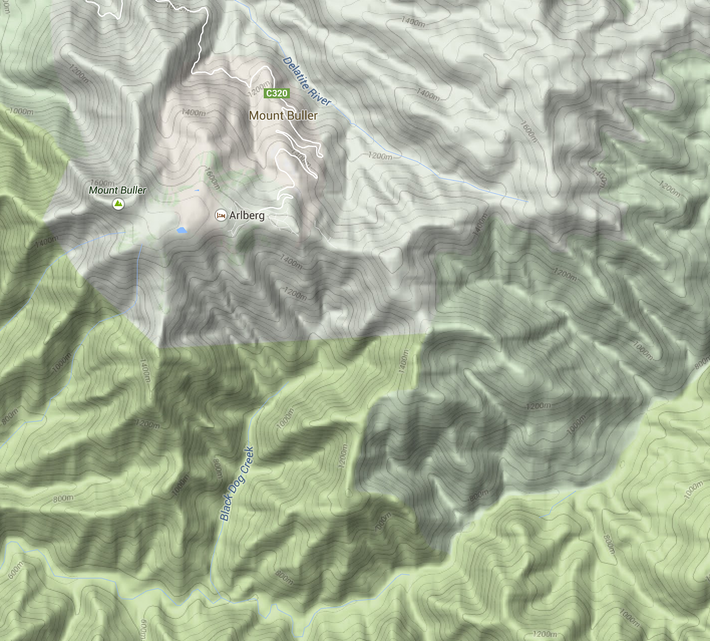
The terrain data is a 20 metre-resolution digital elevation model from DEPI, within Victoria, trickily combined with a 90m DEM elsewhere, sourced from SRTM (NASA). I use TileMill‘s elevation shading feature, scaled so that sea level is a browny-green, and the highest Australian mountains (around 2200m) are white, with green between. 20-metre contours are shown, labelled at 100m intervals.

I’m really happy with how it looks. Many other comparable maps have either excessively dark hill shading, or heavy contours – or both.

Screenshot 2015-01-09 19.21.02

4UMaps

Screenshot 2015-01-09 19.20.35

Komoot

Screenshot 2015-01-09 19.20.24

OpenCycleMap

Screenshot 2015-01-09 19.20.15

Sigma

Mapbox Outdoors

Google Maps (terrain mode)

Screenshot 2015-01-09 19.35.37

MapBox Outdoors


Other basemaps

Screenshot 2015-01-09 19.39.25

VicMap

I’ve included an assortment of common basemaps, including most of the above. But the most useful is perhaps VicMap, because it represents a completely different data source: the government’s official maps.

Layers

Vegetation

Vegetation

There are also optional overlays. Find a good spot to stealth camp with the vegetation layer.

Or avoid busy roads with the truck volume layer. This data comes from VicRoads.Screenshot 2015-01-09 19.47.43

The bike shops layer makes contingency planning a bit easier, by making bike shops visible even when zoomed way out. The data is OpenStreetMap, so if you know of a bike shop that’s missing (or one that has since closed down), please update it so everyone can benefit.

Screenshot 2015-01-14 00.06.20

Mobile

Unfortunately, the site is pretty broken on mobile. But you can download the tiles for offline use on your Android phone using the freemium app Maverick. It works really well.

Other countries

Screenshot 2015-01-14 00.46.05

is.cycletour.org for Iceland. Yes, it’s real – but I don’t know how long I will maintain it.

It’s a pretty major technical undertaking to run a map for the whole world. I’ve automated the process for setting up cycletour.org as much as possible, and created my own version for Iceland and England when I travelled there in mid 2014. If you’re interested in running your own, get in touch and I’ll try to help out.


Feedback?

I’d love to hear from anyone that uses cycletour.org to plan a trip. Ideas? Thoughts? Bugs? Suggestions? Send ’em to stevage@gmail.com, or on Twitter at @Stevage1.

7 reasons to release that government dataset

As a data guru in residence, I’m helping government bodies prioritise which datasets to release as open data. Sometimes people say “No one would ever find this data interesting, so why bother releasing it?” I think there are several distinct reasons why a given dataset might be worth releasing. Some datasets are valuable for several reasons simultaneously. Some aren’t valuable at all.

When a public servant comments that a potential dataset isn’t interesting or useful, ask: “are there other reasons to release it”?

But if a dataset fails to meet any of these criteria? You have my permission not to release it.

#1 Build an app around it

Census Explorer, by Yuri Feldman, allows easy exploration of part of the 2011 Australian Census.

Datasets like public transport timetables, public bike share station status, or parking space availability are obvious candidates for third party developers to use to build an app. Unfortunately, these examples also require near-realtime feeds in order to be useful.

#2 Support other apps

Even if a dataset isn’t interesting or useful enough to warrant an app in its own right, it could add value to another website or app if it’s easy to use. I’ve come across many of these:

  • Average traffic volume on roads maintained by VicRoads, used to help cyclists decide which roads to avoid, on cycletour.org.
  • The slope of footpaths around Melbourne can help wheelchair users navigate the city.
  • The location and species of every tree in Melbourne can add colour and interest to a map of the city.
  • Locations of drinking fountains could be useful for cycling, jogging, or dog walking apps or websites.
Vicroads traffic volume

Which way would you cycle to Port Albert?

#3 Interesting for research

If a dataset is big, rich, detailed and high quality, then there’s a pretty good chance it’s worth of some kind of analysis. If it’s unique enough, then it might even interest a researcher in starting a research project just to look at this dataset.

Examples: building permits database, public transport timetables (for urban planning).

#4 Supporting other research

Much more common than such a rich dataset is small datasets that researchers find useful to solve particular problems, add context, or strengthen an analysis. Local Government Area boundaries aren’t inherently interesting, but they’re one of the geospatial datasets that researchers request the most often. The ATO’s Standard Business Rules taxonomy sounds incredibly dry to me, but is of potential use to lots of people trying to glue different kinds of data and applications together.

#5 Policy and analysis

Lots of organisations need government data to develop internal strategies or policies to be shared with the public – or even to influence government. Typically they get the data either by transcribing tables from official reports, or by developing direct relationships with the government body in question. Publishing data directly to an open data portal allows a wider range of groups to make use of it, without the overhead of having to ask whether the data is available. Data that is collected regularly, in the same format is a particularly likely to be useful.

#6 Transparency

If the data relates to how government decisions are made, it may be worth releasing to demonstrate transparency – regardless of how much the dataset is even used. For example, releasing annual budget data as an easy to use spreadsheet makes a big political statement about willingness to be scrutinised. Even if no citizen takes up the opportunity to crunch the numbers, they may still appreciate having that option.

Examples: annual budgets, revenue sources (parking meters, speeding fines), parliamentary voting records.

#7 Insights for government

If you’re really lucky, the dataset you publish may help another part of government do something useful. I think good things happen when people can access data without having to ask anyone for it, and the some goes for governments themselves. You can’t really expect insights, but if it happens – great.

The Data Guru in Residence

Cross-posted at Code for Australia.

Last week, Code for Australia launched its first fellowship program, a four-month project where a civic-minded developer will try a new approach to helping government solve problems with their data. For the next few months, I’ll be the Data Guru in Residence, blogging mostly to http://melbdataguru.tumblr.com. The program got a brief mention in The Age.My goals are to find interesting and useful datasets, help make them public, and do fun stuff with them. It’s a kind of test run for the Code for Australia hacker in residence program currently being developed. Since I work for the University of Melbourne, I’ll be targeting datasets that are useful for researchers, and using VicNode to store data wherever it’s needed.

To start with, I’m spending some time with the CityLab team at City of Melbourne. They’re very progressive on the open data front, and their Open Data Platform has some really high quality datasets, like the 70,000-tree Urban Forest or the Development Activity Monitor which contains detailed information on property developments.

“Living, Breathing Melbourne”, our GovHack Project, would be so much better with live data feeds.

Some of the immediate datasets on the radar are finding live feeds from the city’s pedestrian sensors and bike share stations. I’d love to incorporate these into the successful Govhack project, Living Breathing Melbourne, built with Yuri Feldman and Andrew Chin. There’s also lots of interesting data from the Census of Land Use and Employment with immense detail on how floorspace is divided up between residential, retail, commercial and so on. There areMahlstedt fire plans, LIDAR data, and a really detailed, textured 3D model of the CBD. And of course other data that’s already public, but whose full potential hasn’t yet been realised.

If you’re from a government body (Federal, State, Council, or agency), based in or around Melbourne and you could use the services of a Data Guru, please get in touch!

Cycletouring and OpenStreetMapping: a beautiful symbiosis

Contributing to OpenStreetMap is diversely rewarding: you help other people, you make open data as a whole more viable, you learn a lot about the area you’re mapping, and it’s fun. But sometimes it’s just plain pragmatic. Last weekend, I organised a cycle tour from Bendigo to Avenel, via the O’Keefe Rail Trail, Lake Eppalock, Colbinabbin, Rushworth, Murchison and Nagambie. When I started planning the route, OpenStreetMap looked like this:

Image

The major features are all there, but what’s missing is what matters most to cycle tourists: quiet country roads, and road surfaces. Is there a way to get from Eppalock to Colbinabbin on only sealed roads? Is Buffalo Swamp Rd (near Murchison) really sealed? A great way for me to research is to add to OpenStreetMap: use aerial imagery to add new roads, paying attention to whether they look sealed or not from the air.

Image

So Buffalo Swamp Road is obviously not sealed after all. By the time I was done, the map of the area looked like this:

Image

Notice how many “sealed” roads have turned out to be dirt, but also how many other unmapped little roads have been added to the map.

Once this is done, the steps are:

  1. Finalise the route, using OSRM.
  2. Send GPX files to everyone on the trip
  3. Load the GPX files onto both my GPS and Maverick Pro, an Android App
  4. Also load the cycletour.org tiles into Maverick
  5. Ride
  6. Update OpenStreetMap afterwards with any fresh information – obstacles, unexpected connections, local businesses, and so on.

There’s still lots more to add, but it’s nice that just planning this one trip has significantly improved coverage in a whole region like this.